Even in an age of declining print runs and disappearing subscribers, the magazine cover still has the power to shock and surprise. In fact, as our lives become increasingly digitized, magazine covers can feel like one of the few fixed points in our ephemeral visual culture. As The Guardian’s creative director Alex Breuer said, “The print cover has a unique value in marking key moments and preserving them in a way digital platforms are less successful at because of their need to change and update.” So what can some of the most iconic magazine covers ever teach us about creating images that last longer than a hot social media second? Let’s take a look.
1. Well-concealed nudity can have a massive impact.
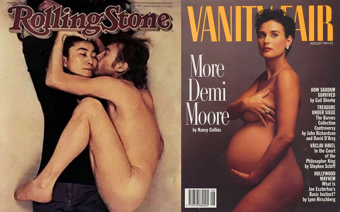
Rolling Stone (January 22, 1981)
John and Yoko
Vanity Fair (August 1991)
“More Demi Moore”
Photographed by Annie Leibovitz, this Rolling Stone cover’s lasting impact isn’t due just to the strength of its image. The photo was taken mere hours before Lennon was gunned down at his home in the Dakota, in New York in December, 1980. Leibovitz explained the photo’s impromptu origins to Racked, “The ’80s were not a romantic time and I asked [John and Yoko] to crawl up together. I wanted them both to be naked, but Yoko wouldn’t take off her pants so I said, ‘why don’t you keep everything on?’ In those days, you pull a Polaroid and the three of us knew right away it was good.”
Another notorious Leibovitz cover image, ten years later, also gained instant notoriety. Many credit this photo of Demi Moore, seven months pregnant with her second child, for sparking a trend in flaunting one’s pregnancy. Tina Brown, then editor of Vanity Fair, described the photo: “Anti-Hollywood, anti-glitz, a new young movie star willing to say, ‘I look beautiful pregnant,’ and not ashamed of it.” At the time, that lack of shame was not quite universal. Outside of New York, newsstands featured the issue sheathed in white paper, only Moore’s eyes visible above the wrapping.
2. Let the image do the talking.
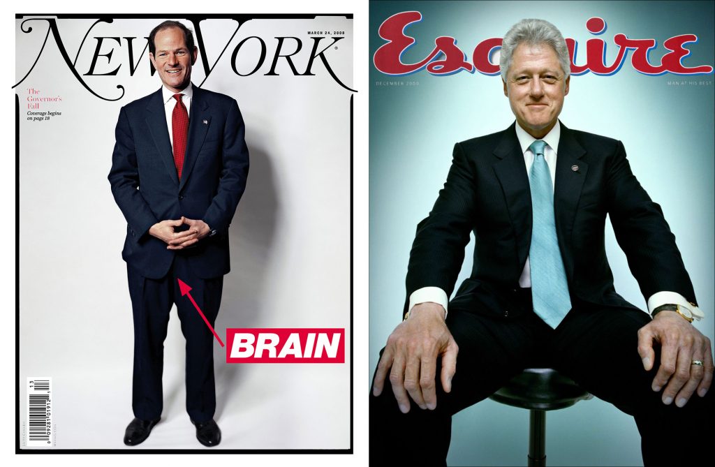
New York (March 2008)
Eliot Spitzer
Esquire (December 2000)
President Bill Clinton
Following New York Governor Eliot Spitzer’s sex scandal, artist Barbara Kruger simply added an anatomical note to an otherwise unremarkable portrait and created a cover that’s hard to forget, no matter how we might try. The image went on to win ASME’s 2008 Cover of the Year.
Ironically Bill Clinton’s cover shoot was not intended to evoke a sexual swagger at all; his pose was meant to evoke that of the Lincoln Memorial. But the portrait from famed photographer Platon quickly came to signify a lot more than presidential monumentality.
Platon later recounted the shoot for RESPECT. “I put on my usual lens and I said to him, ‘Mr. President will you show me the love?’ and everyone in the room gasped in horror, because it was about 30 people in the room—all his White House aides, the drivers, security—and they all were like, ‘Oh no whatever you do, whatever this guy’s after, don’t give it to him.’ And Clinton told everybody to shut up and he knew what I wanted and he put his hands on his knees and he gave me the Clinton magic.”
3. Worried your subject is over-exposed? Try a caricature.
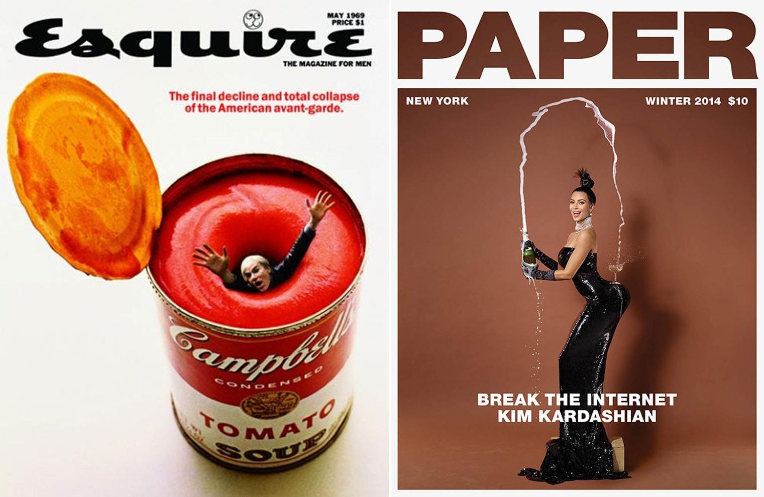
Esquire (May 1969)
Andy Warhol Soup Can
Art director: George Lois
Photographer: Carl Fischer
Paper Magazine (Winter 2014)
“Break the Internet: Kim Kardashian”
Legendary Esquire art director George Lois is responsible for some of the most legendary covers of all time and well-known for his ability to convey big ideas in visually arresting imagery. Lois later explained the Andy Warhol cover to New York: “This was hot shit. The article was basically a caustic review about what was going on in the arts in America at the time, and without even reading it, I knew I wanted Andy Warhol drowning in his own soup. I just had the image in my head. And I called him, and said, ‘Andy I want you on the cover of Esquire.’ And he said, ‘Wait a minute, George, you always have an idea on the cover, what’s the idea?’ And I told him, and he said, ‘I love it!’”
Photographed by Jean-Paul Goude (with the aid of some computer enhancement), Paper’s now-ubiquitous cover was faced with one big challenge: how do you create something new when you’re photographing one of the most photographed women in the world? Goude’s answer was brilliant in its simplicity—take Kim’s iconic silhouette and give it cartoon-like proportions—and it did nearly break the internet.
4. Religious imagery isn’t just for Renaissance paintings.
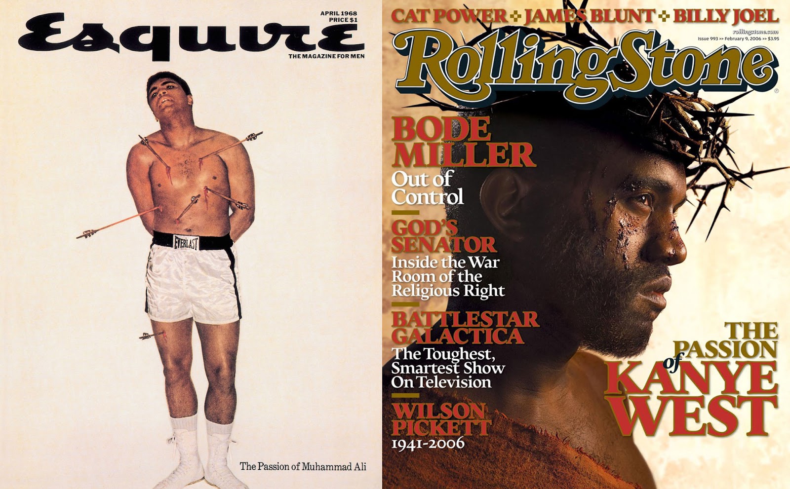
Esquire (April 1968)
Muhammad Ali / St. Sebastian
Rolling Stone (February 2006)
Kanye West
Yes, it’s another George Lois cover (and there’s still more to come), this time depicting Muhammad Ali as martyr and icon Saint Sebastian. After refusing to be drafted into the U.S. Army, as well as his controversial conversion to Islam, Ali’s star was on the wane in 1968, inspiring Lois to draw upon religious imagery.
There was just one problem—the boxer wouldn’t pose as a Christian saint. In an attempt to save the shoot, Lois called Elijah Muhammad, head of the Nation of Islam. Lois later explained, “Elijah Muhammad and I had [a phone call]—maybe it was three minutes, but it felt like 20 minutes. He wanted to know who I was, how old I was, am I religious. We talked about symbolism and martyrdom. He knew full well why I was doing it. Finally, he said, ‘I think it would be a very good image.’”
David LaChapelle went with a more familiar religious icon for his 2006 photoshoot with Kanye West. West was going through his own troubles at the moment, having declared that “George Bush doesn’t care about black people” at a Katrina fundraiser several months before. “I wanted to make it look exactly like the DVD cover of The Passion of the Christ,” LaChapelle said, “right down to the individual thorns.”
5. Sometimes text is all you need.
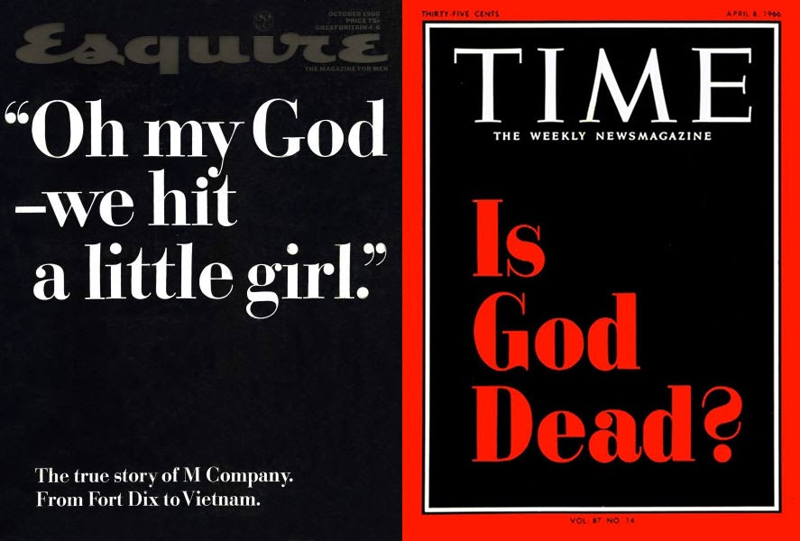
Esquire (October 1966)
“Oh my God—we hit a little girl.”
Time (April 8, 1966)
“Is God Dead?”
For Esquire’s harrowing 1966 feature story from John Sack, in which he received permission to train with a company at Fort Dix and follow them to Vietnam, George Lois stripped away both color and imagery, letting that one nightmare-like quote carry the page. “The cover came out and six or seven senators got up and said, ‘How dare Esquire do this, they’re traitors!’” Lois said. “So that was a bombshell, that was the first real anti-war cover, the first time a magazine dared. It was the young people who were the biggest fans of Esquire; they understood the humor and the anti-establishment feeling of it.”
A few months before Esquire, however, Time magazine gave their cover much the same treatment to ask a big (maybe the biggest) question: Is God dead? The story from Time religion editor John Elson didn’t say either way, but that didn’t stop the issue from becoming a lightning rod for the general public’s outrage. The magazine received more than 3,500 letters to the editor; it also gave Time its best newsstand sales in 20 years.
6. There’s power in the eyes.
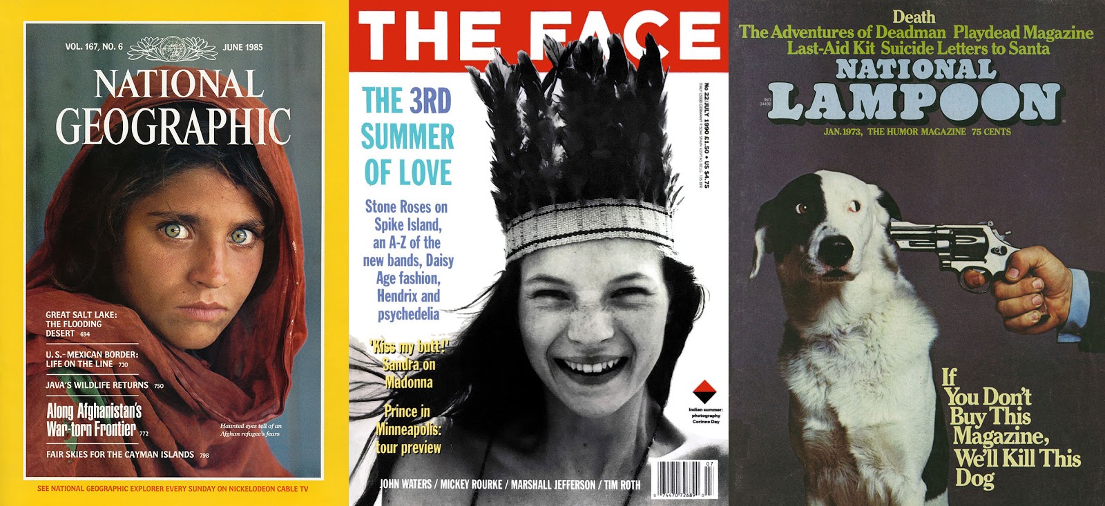
National Geographic (June 1985)
Afghan Girl
The Face (July 1990)
Kate Moss
National Lampoon (January 1973)
Styled by Melanie Ward
This legendary cover portrait of an Afghan refugee by Steve McCurry launched a mystery—who is she? As the editors of National Geographic wrote in 2002, “Her eyes are sea green. They are haunted and haunting, and in them you can read the tragedy of a land drained by war. She became known around National Geographic as the ‘Afghan girl,’ and for 17 years no one knew her name.” But in 2002, McCurry, with help from the magazine, managed to relocate Sharbat Gula, now in her thirties, living in a remote village near Tora Bora devastated again by war, only this time an American one.
The 1990 cover of “The Face,” which helped launch the career of a sixteen-year-old Kate Moss, feels as if it were announcing the launch of Cool Brttannia. But photographer Corrine Day’s recollection of the shoot isn’t as idyllic as Kate’s smile would have you believe. Moss locked herself in a bathroom, crying, because she was asked to go topless. “I see a 16-year-old now and to ask her to take her clothes off would feel really weird,” Day later said. “But they were like, if you don’t do it, then we’re not going to book you again.”
Ronald Harris’ photograph of the dog, Mr. Cheeseface, was also difficult to capture, though thankfully far less exploitative. “The shot was extremely hard to get,” managing editor Tony Hendra recalled for The Guardian. “When the dog looked straight out at the reader he simply appeared victimised. Then someone had the notion of actually pulling the trigger. The dog reacted to the noise and this was the result.”
In a very sad, strange coda, it appears that Mr. Cheeseface eventually did die at the hands of a gun-wielding man in Vermont, sometime in 1976.


