Every font has a story. Every typeface carries the cultural marks of their makers, along with the stories of the political and cultural moment in which they were designed—but to date, those histories have been largely devoid of experiences from Black, indigenous, and people of color (BIPOC) designers.
Graphic design is, and has always been, a predominantly white industry (and its leaders are mostly male). According to AIGA’s 2019 Design Survey, only 29% of the 9,429 respondents identified as a designer of color, with only 3% identifying as Black.
There’s no way to correct for this lack of diversity without making significant changes industry-wide, and nurturing those changes takes time. But one small, easy-to-implement adjustment is to make the active choice to support BIPOC designers. And one way of doing that is to start using different fonts—both by using typefaces created by designers of color and also by not using fonts with racist histories.
That’s the argument made by Agyei Archer in his essay, “Type Choice, Political Choice,” in which he explains that using a type that doesn’t have a fascist or racist history should be an easy decision, if diversity is a priority. Archer specifically cites DTL Prokyon, drawn by anti-Islamic German nationalist Erhard Kaiser, as one such font with a troubling backstory.
“If type design, like any other industry, wants to open itself to inclusiveness and diversity, that means necessarily distancing itself from forces that undermine those values,” he writes. In other words, the more conscientious and discerning designers become about font choice, the more inclusive the industry will become.
There are still too few BIPOC type designers working today, but those that are out there are producing beautiful—in some instances, radical and experimental—fonts. Typefaces with new stories to tell. We’re ceding the floor to these lesser-known designers deserving of a platform—here are a few of their fonts to add to your book.
Martin by Tré Seals
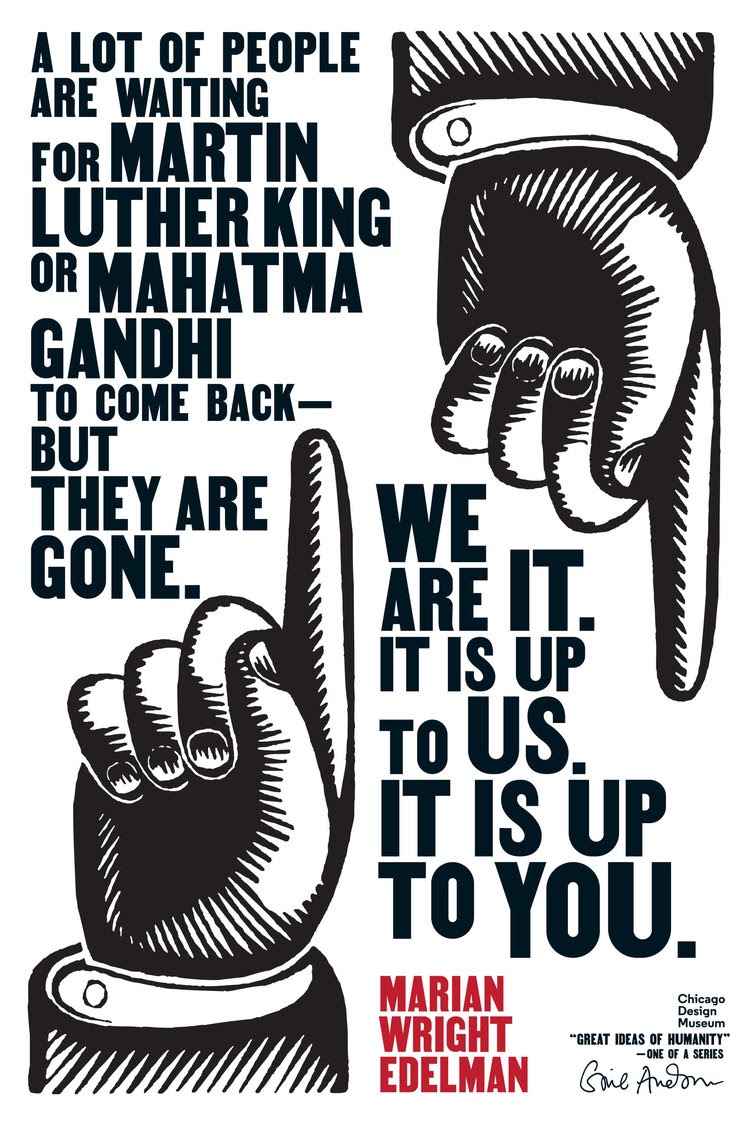
Vocal Type, a foundry started by Tré Seals, designs typefaces that draw inspiration from historical movements and moments in Black culture and the cultures of other marginalized communities, creating typographic legacies for radical thinkers of color. Some of Seals’ currently available fonts include Eva, named after the Argentine feminist and socialist icon Evá Peron; William, inspired by W.E.B. Du Bois’ hand-drawn infographics; and Ruben, for Rubén Salazar the first journalist to support the Chicano movement. For Martin, named after Martin Luther King, Jr., Seals developed the typeface from imagery of the civil rights movement—in particular, a series of broadsides printed for the 1968 Memphis Sanitation Workers Strike, which said “HONOR KING: END RACISM!” and “I AM A MAN.”
Freight Sans by Joshua Darden
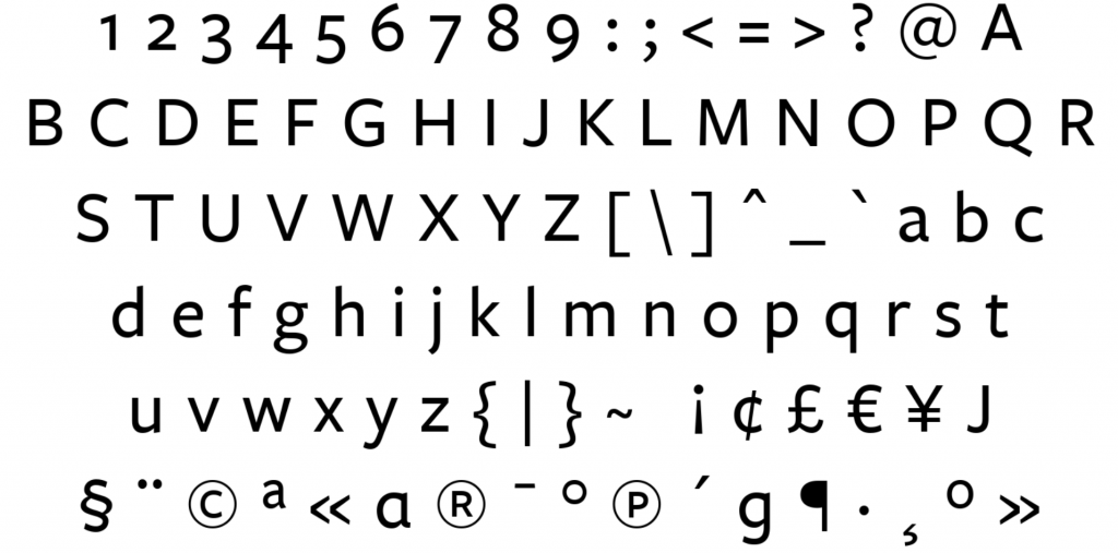
Joshua Darden designed Freight Sans while he was still working at GarageFonts, the foundry set up to distribute the typefaces that were used in Ray Gun magazine. Since then, the rounded sans serif has been the cornerstone of many a visual identity, including The National Museum of African American History and Culture and Vrbo. In 2004, Darden founded Darden Studio and has gone on to design six other typefaces, including the slab serif Jubilat and the grotesque sans serif Halyard—which you can see paired with Darden’s seriffed Freight Text in the visual identity of Notation Capital. The Freight Sans font family can be found at Phil’s Fonts.
Format 1452 by Frank Adebiaye
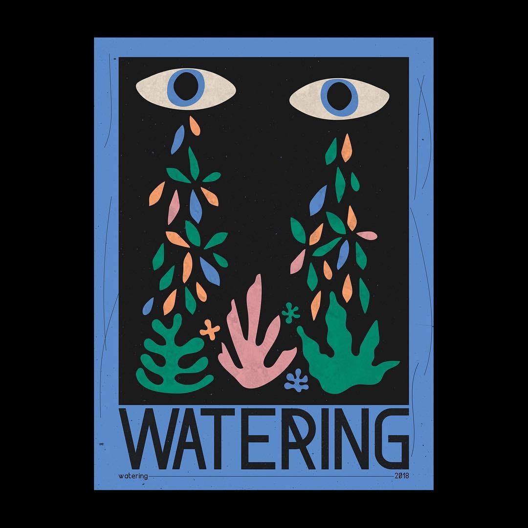
In 2010, writer and type enthusiast Frank Adebiaye founded Velvetyne, a foundry that designs and distributes open-source typefaces, creating a digital space that encourages collaborative experimentation with an anti-capitalist flavor. In the last decade, the foundry’s reach and influence has grown, garnering attention with some of its more popular offerings—including the brutalist serif Bluu by Jean-Baptiste Morizot and the calligraphic Pilowlava by Anton Moglia and Jérémy Landes. Adebiaye’s own Format 1452 is a modular sans serif based off the stolid Din 1451—but with certain characters bestowing the font a geometric flair. In the eye-catching uppercase R, for example, the tail diagonally extends to the full height of the letter, cutting across the counter.
Cabeza Grossa by Kwesi Amuti

Originally from Ghana, Kwesi Amuti is the founder of the design studio AKOFA and the foundry AKOFAType. Based in Atlanta, Amuti has worked with clients like St. Jude’s Children’s Hospital and Rheem Manufacturing Co. on custom typefaces. Cabeza Grossa is a slightly modified interpretation of Jackson, a top-heavy blocky typeface from the ’70s that’s ideal for big displays. Amuti’s West African upbringing has also influenced his type design—as can be seen in his symbol typeface Adinkra. It takes the iconography of traditional West African art as its inspiration, and even goes so far in some cases as to mirror the style, lending the symbols a hand-drawn quality.
Redaction by Jeremy Mickel and Forest Young

This collaboration between Forest Young, global principal of Wolff Olins, and Jeremy Mickel, a white type designer behind MCKL, was created for 2019 art project The Redaction, which sought to highlight the injustices of the criminal justice system. In this particular case, the focus was on the practice of keeping those who cannot make bail incarcerated. Redaction was the concept and the process by which the project came together: Betts used lawsuits filed by the Civil Rights Corps (CRC) as source material, redacting lines to create found poems that were then overlaid onto Kaphar’s etched portraits of incarcerated people.
Young and Mickel carried the theme of redaction into the type itself. They created a font to mimic the process of degradation that a legal document undergoes when it’s photocopied. Drawing inspiration from legal-standard Times New Roman and New Century Schoolbook, Redaction is available in seven “grades” of degradation, from a highly legible, formal serif to a barely legible pixelated font. These various “grades” echo the dehumanizing process of incarceration itself: “The typeface nods to the transformation and marginalization that many people face in the criminal justice system today, and specifically, the role and responsibility of the author of text to be conscious of legibility as a signature of power.”
Crispy by Agyei Archer
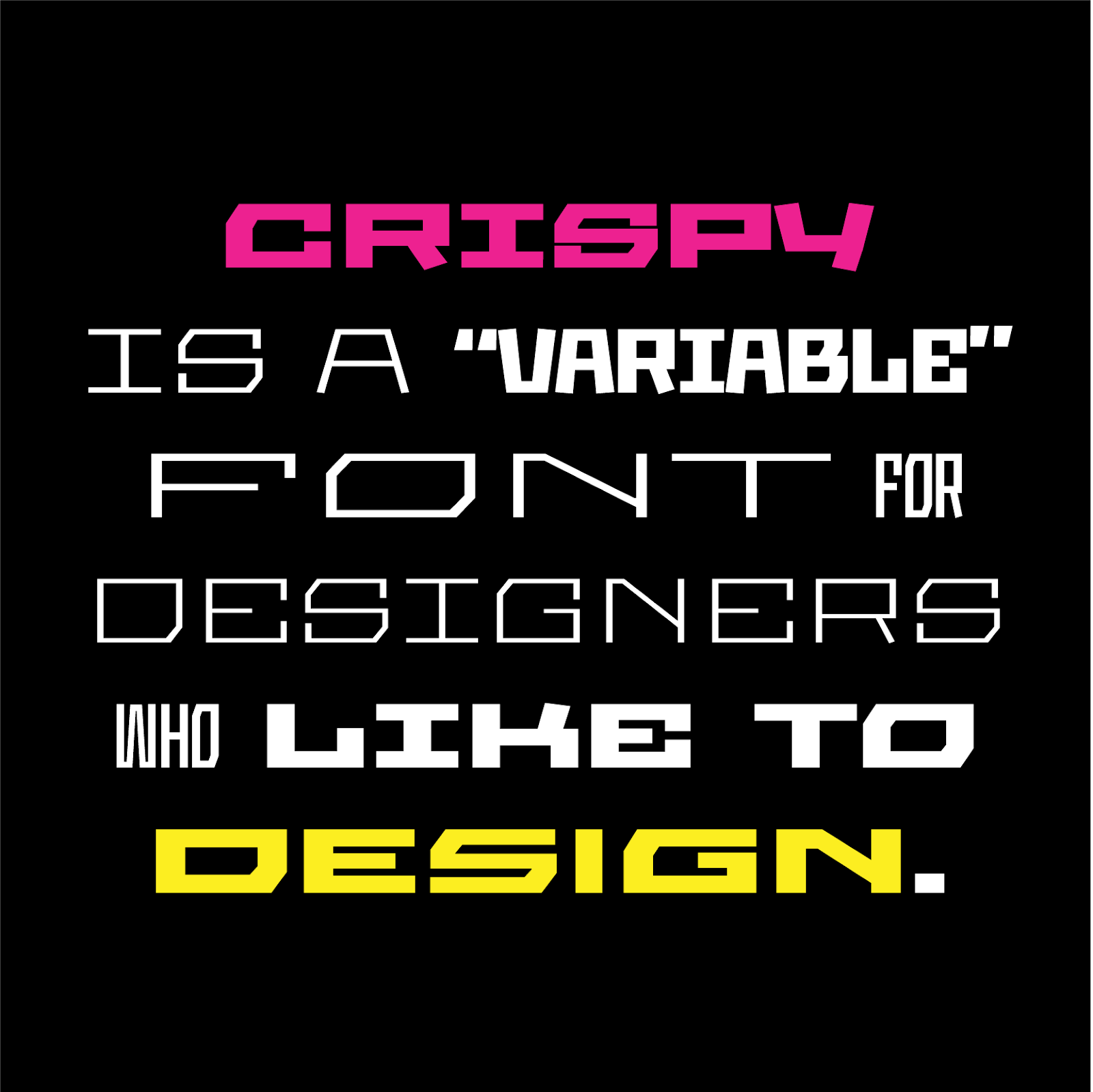
Archer, a designer based in Trinidad, originally designed this work in progress for the brand identity of a software development startup. Archer met them and took them on as a client because of his work as co-director of Design Objective, a nonprofit community of designers in Trinidad and Tobago whose mission is to support and advocate for one another. Since then, Archer has developed Crispy into a dynamic variable font for Google Fonts, with hard angles and extreme weights that evoke the brittle, crunchy connotations of the word itself. Find the open-source typeface here.
The Colonial Bastard Rhodes by Osmond Tshuma
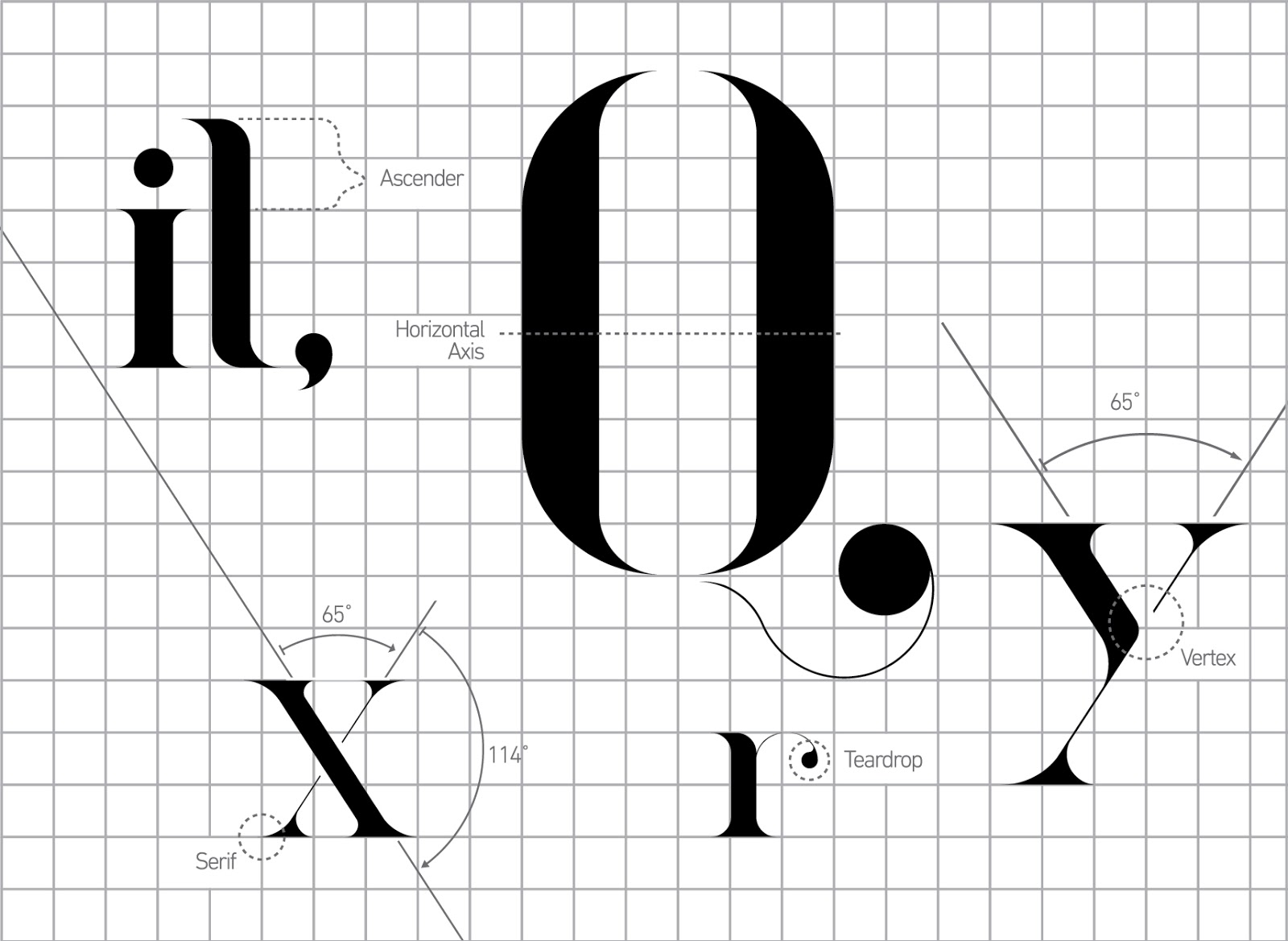
Zimbabwean designer Osmond Tshuma made this typeface when he was still a student at the University of Johannesburg in South Africa. Named after British imperialist politician Cecil John Rhodes, the font was intended as a critique of the early British Colonial Era, harkening back to popular typographic styles of the time—like this Pears’ Soap advertisement from 1899. The typeface’s elegantly exaggerated serifs and hairline strokes are intended to be aesthetically pleasing, calling attention to the troublesome ways in which colonial histories can be excused or ignored.
Tshuma intended the title to shock. “The title was my own way of expressing my frustration at how these colonial figures are still being celebrated today,” he said in an interview. “Colonialism was an act of brutality clothed in the farce of civilisation. Families were displaced, enslaved, massacred, wealth stolen and yet the names of these perpetrators are mounted on street names and buildings.” This font ise not actually available to use, but its addition on this list acts as a reminder that every typeface carries with it a long history—and that history should be considered every time a font is used.


