Even as technology transforms the world around us, board games are more popular than ever. According to Fast Company, the tabletop game industry has grown by 40% in the past five years, with something like 1,500 new board and card game releases in the last year. And that growth was occuring before COVID-19 sheltering-in-place put a premium on good board games.
Good design can make or break a game experience. Whether a game is coded or cardboard, it can grip players in a tactile and experiential way that has a real emotional impact—and a good design can sometimes be the thing that helps players stay invested. Here are a few modern, beautifully designed games that show us how good design can influence a game experience and make games more fun to play.
Pandemic
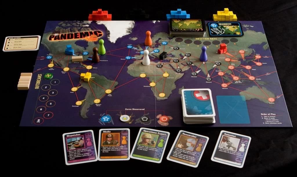
Game designer is something of a second career for Matt Leacock, the creator behind Pandemic—he actually started his career in the tech world. “I’m still a user experience designer,” he said at a conference in 2016, “but I deal in cardboard now.”
Even if you didn’t know it, Leacock’s early experience in UX shows in his board game work. Designed in response to the SARS epidemic in 2004, players work together to fight the threat of deadly diseases by balancing the short-term goal of mitigating outbreaks and with the long-term solution of finding a cure. The original board (pictured above) was a busy map, crowded with flight paths and rubrics for outbreaks and infection rates and decks of cards—but the various elements of the game were simple, and the variables few, which allowed for most of the game play to happen in the tactical thinking. The board has been updated since: The redesign makes it look more like a flight console, or the wireframe for a science fiction film.
Fafnir
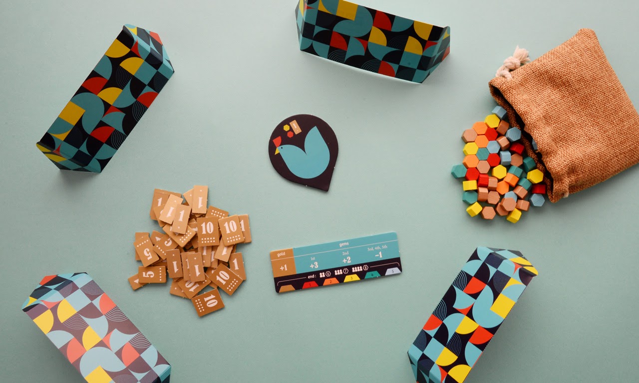
A chicken named Fafnir lays two valuable gems a day—sometimes more. Players basically compete in auctions to acquire the most valuable gems, and the one who ends the game with the most of them wins. That’s the simple premise behind this high-paced abstract strategy game designed by Jun Sasaki for Oink Games. As with other popular microgames from Oink Games, like Deep Sea Adventure (which comes highly recommended by New York Magazine) and Troika, Fafnir is tidily packaged with each piece in accordance with an overarching design.
Every piece—from the wooden hexagonal-shaped gems to the cloth bag that they’re stored in—adheres to the same six-color palette. The bright blue chicken on the Fafnir “board” is composed of circle quadrants, establishing a pattern which is then reiterated on the “dividing screens” that players hide their precious gem collections behind. All these pleasing, tactile enhancements help to make the mental strategy of duping your fellow players of their loot all the more sophisticated and entertaining.
IDEO Method Cards
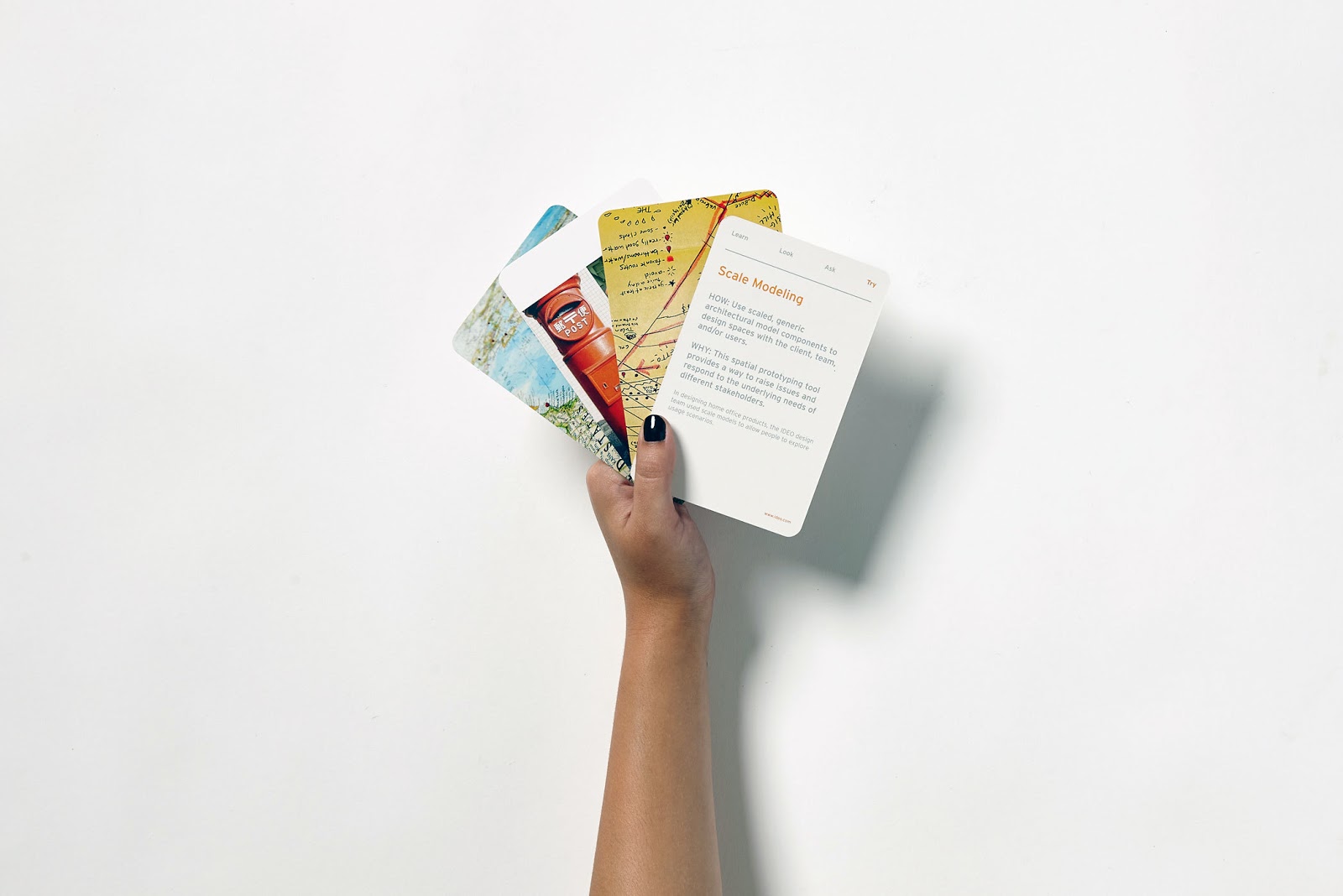
This is not so much an example of good game design as it is an example of gamifying design. IDEO Method Cards are a great way to introduce an element of play when you’re stuck in the creative process. There are 51 cards in the deck, separated into four categories—Learn, Look, Ask, Try—each featuring a different method or aspect of IDEO’s design process, as well as an example of how to use it. For example, one “Try” card encourages players to take a shot at scale modeling, which IDEO uses to allow people to explore usage scenarios. While there aren’t any “rules” for how the game is played, these cards can help you gain a new perspective or suggest a new design approach when you’ve hit a wall.
Wingspan
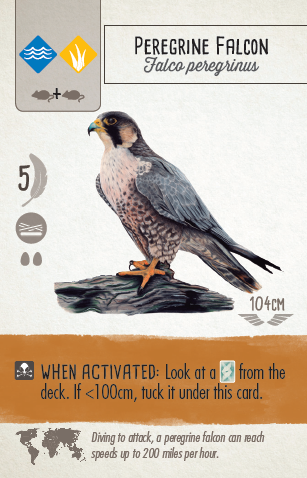
What sets Wingspan apart from other engine-building games—Catan, for example—is the narrative it’s built upon. Players are bird enthusiasts who try to attract the best birds to their respective wildlife habitats. Designed by Elizabeth Hardgrave for Stonemaier Games, the game’s standout feature is its 170 unique bird cards—illustrated by Natalia Rojas, Ana Maria Martinez Jaramillo, and Beth Sobel—which give players scientifically accurate information about each creature. Hardgrave used data from the Cornell Lab of Ornithology and the Audubon society to create a system so that she could rank these 170 birds—calculating everything from their genus and habitat to their wingspan and nest type. The cards are matched by the other high quality game components—like the 75 miniature wooden eggs painted in Easter pastels, and the wooden dice that are kept in a “moss”-covered bird feeder.
PARKS: The Board Game
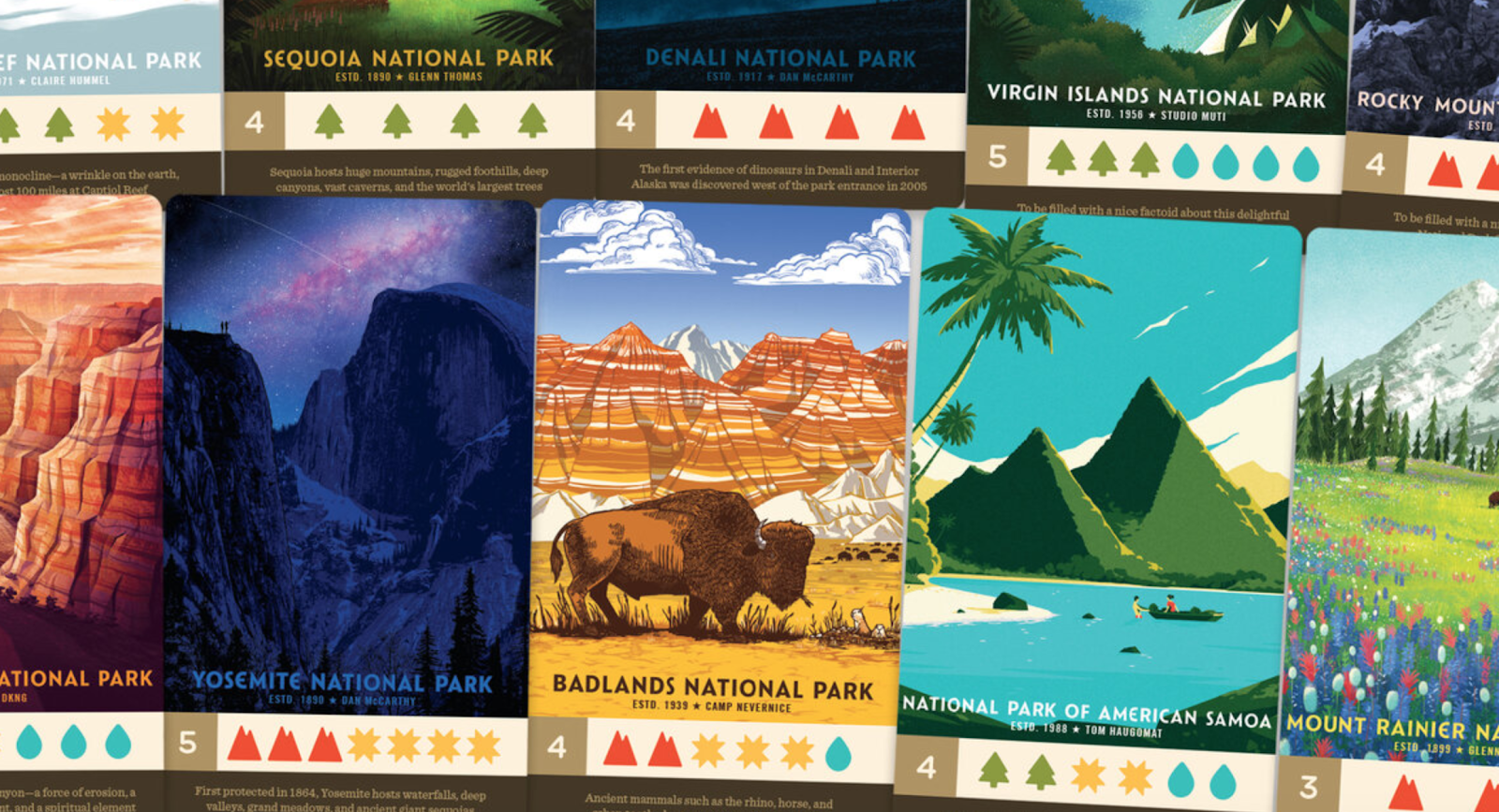
Designed by Henry Audubon for Keymaster Games, this game is built around the illustrations of the Fifty-Nine Print Parks Series. The cards look like miniature versions of the popular posters and have been designed with a flexible layout, so that information doesn’t compete with the illustration for attention. In some ways, the very idea behind the print series—the impulse to collect mementos—is integral to the experience of the game itself. Players hit the trails of their favorite parks throughout the seasons, gathering memories and sightseeing along the way. Whoever collects the most memories by the end of their hike wins.
Pipeline
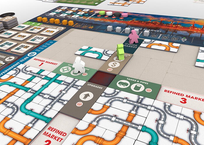
In this tile-laying board game by Ryan Courtney, players compete to break into the oil industry, laying down intricate networks of pipes at the same time that they manage the logistics of their budding company. The artwork for this complicated web of pipes and barrels comes from Ian O’Toole, a graphic designer who actually got his start doing exhibit booths for petroleum companies, and has done art and graphic design for several acclaimed board games.
Because of the complexity of the game, O’Toole sought uniformity and clarity. He cut down on text whenever possible, with every element following the same visually regimented style—except at the top of the Pipeline board, where O’Toole added a splash of color. The illustration, a wild departure from the look and feel of the rest of the board, adds a bit of intrigue, and seems to hazily wash away all possible negative connotations one might have of the oil industry.
Pyramid Arcade
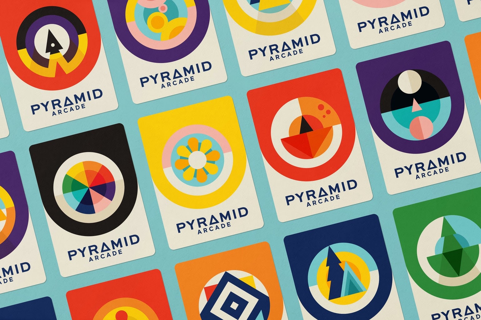
As its name would suggest, Pyramid Arcade from Looney Labs isn’t just one tabletop game—it’s a library of them in one box. Designer Eileen Tjan, who runs Other Studio based in Chicago, explained that the art for the game box had to be flexible and conceptual enough to encompass all 22 games included in the Arcade. “We had to concept an entire art style and brand around two pieces of information,” she said, “there are many games you can play with pyramids, and the pieces themselves.” For that reason, the illustration style is flat, graphic, and highly colorful—like a vintage video game. Each game is represented by its own geometric logo, many of which appear in the main artwork.
The Typeface Memory Game
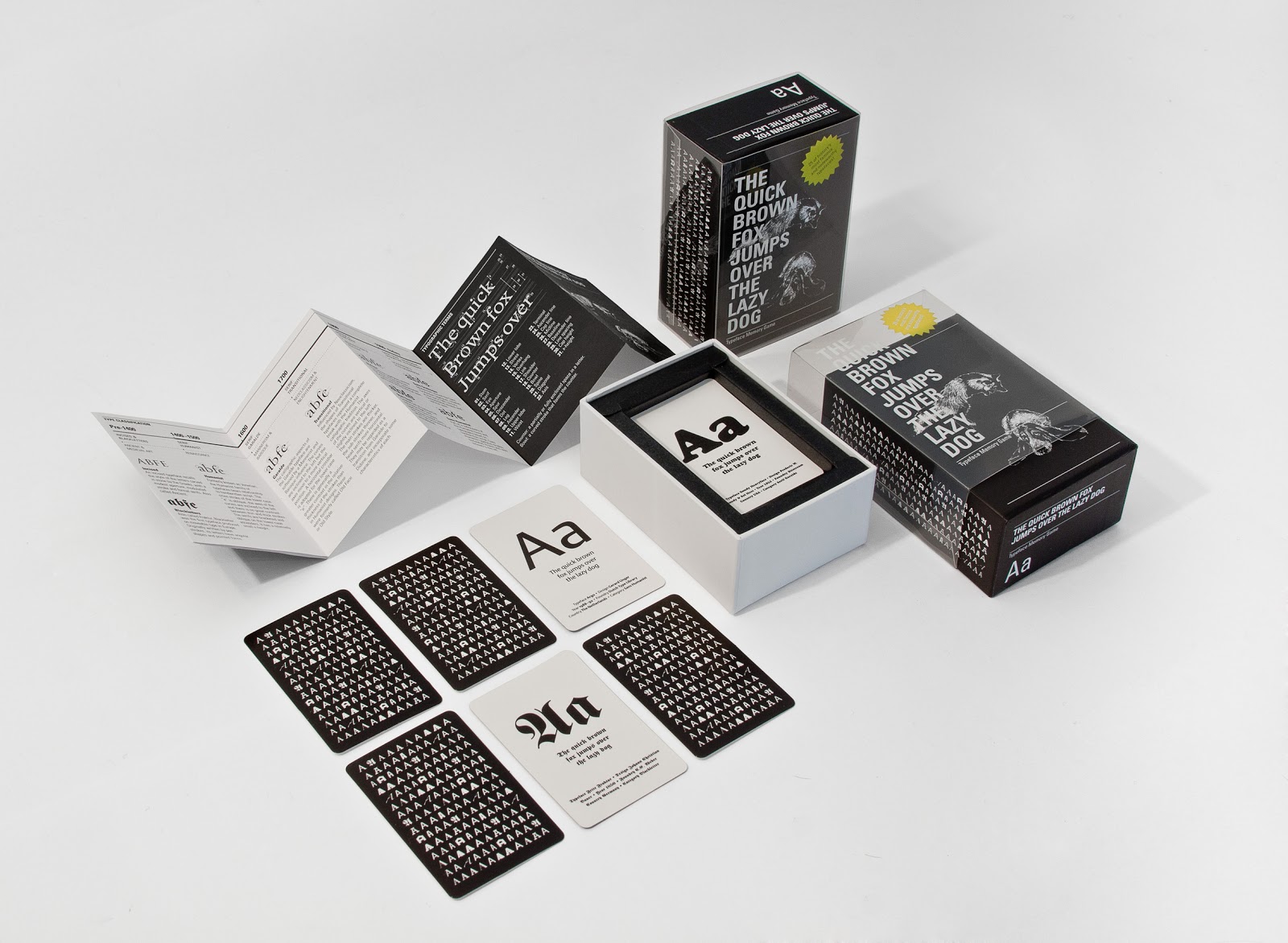
Continuing with the trend of gamifying design, these cards give the classic game of memory a typographic twist—in a way that’s fun for both designers and those who know nothing about type at all. Designed by ps.2, the game comes with 25 pairs of cards, each representing a different font. The deck also comes with a glossary of typographic terms, some background information on the fonts used in the game, and some info on type design in general.

