A logo is so much more than a mere symbol for brands — a successful mark must convey an attitude, a desire, an entire way of life. And the difference between a successful logo and failure often can be measured in centimeters. Check out nine of our favorite classic brand logos and explore what makes for the perfect mark.
Woolmark
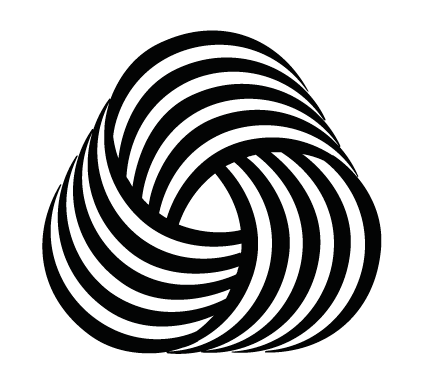
Finding consensus among a consortium of 60,000 Australian wool growers might not seem like the smartest path to creating a lasting logo, but then the Woolmark defies expectation. The identity of the Woolmark’s designer is shrouded in mystery and conspiracy theories (seriously), though we can be certain that the logo won a 1963 international design competition. This op-art classic has been quietly remarkable ever since, adorning the label of any item that’s 100% pure wool.
MTV

MTV’s second logo (the first was similar, though it included a gloved hand holding a musical note) debuted in 1981 and was created by Manhattan Design. In 2009 the logo received its first, and only, substantial makeover: “Music Television” was appropriately removed; the “TV” script was cleaned up, and the “M” became shorter and wider, settling into middle age.

Aside from its iconic design, a good part of the MTV logo’s staying power is surely due to its sheer mutability—the mark does not have a fixed color scheme, allowing the brand to shift tones depending on the context. As Thomas Hine noted in The New York Times in 1996, “The move of information from the printed page to other media has changed the nature of graphic identity. The MTV logo, which emerges from an unexpected metamorphosis, is probably the ultimate in animated identity.”
Centre Pompidou
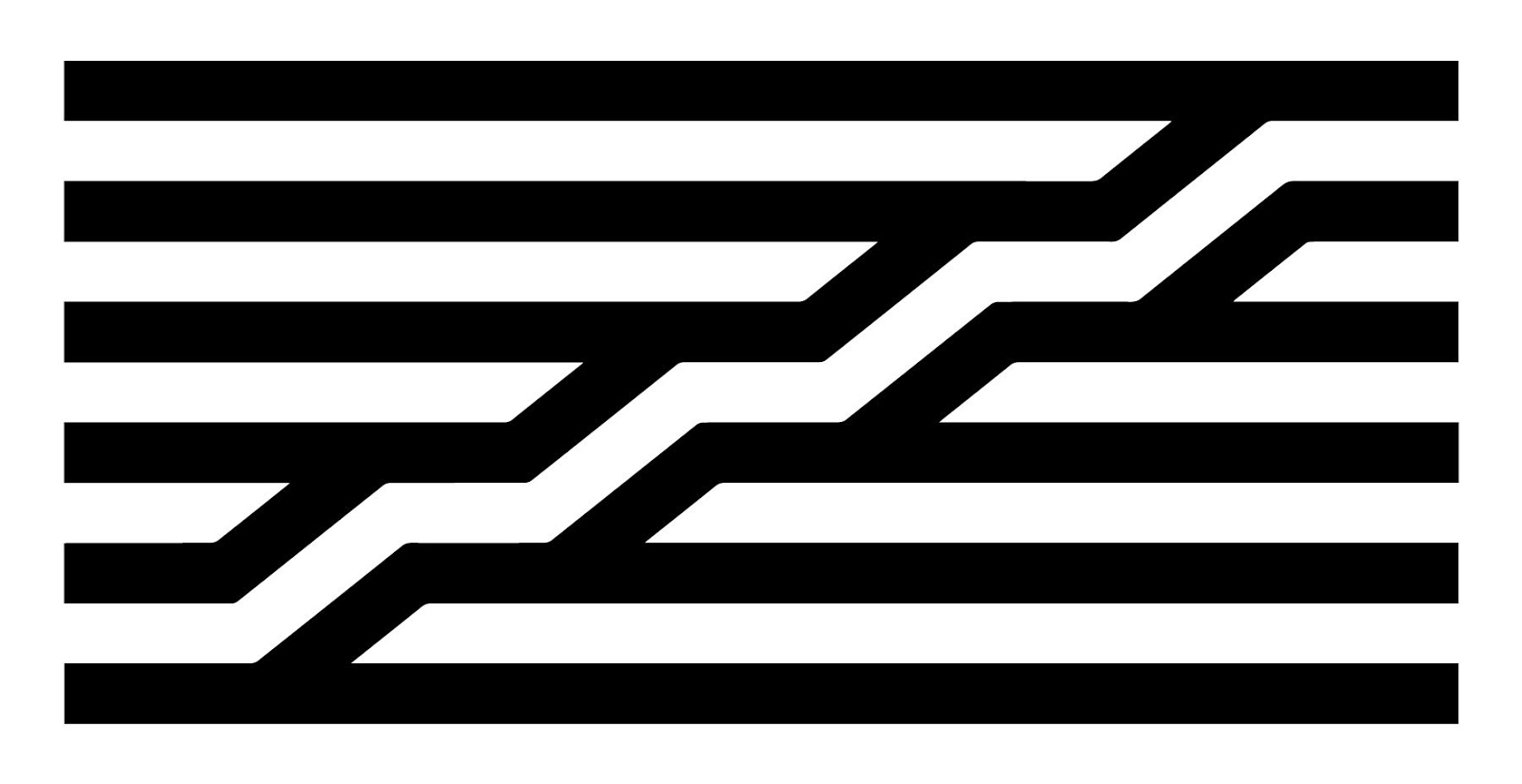
The post-modern Parisian landmark known to Anglophones as The Pompidou Centre was a radical departure when it debuted in 1977. The Renzo Piano and Richard Rogers-designed structure is “inside-out”, with all of its structural, mechanical, and plumbing systems exposed on the outside of the building. The mark for this marvel was created by Swiss designer Jean Widmer, who took direct inspiration from the building’s architecture. Reminiscent of both a flag and the Factory Records logo (itself borrowed from the Situationists), Centre Georges Pompidou’s logo demonstrates that simple, bold lines can wield oversized power.
Chanel

There are a lot of legends behind the interlocked Cs of Chanel. Created by Coco Chanel herself in 1925, the logo was perhaps inspired by a visit to the Château de Crémat in Nice, which features an interlocking Cs throughout. But no matter the origin, that elegant motif carries a great deal of power all on its own.
The same font is used today on all of Chanel’s branding, and the logo has proved its mettle in earrings, handbags, even “dad sandals”, without losing its up-market cachet. Instant recognizability without sacrificing brand integrity is the holy grail of good logo design, and Chanel’s has been doing it for close to a century.
IBM

Paul Rand’s 1972 logo has withstood the test of time far better than the corporation’s punched card technology. His mark transformed the solid lettering of his 1956 design into one of the most recognized logotypes on the planet.
“In the competitive world of look-alike products, a distinctive company logotype is one, if not the principal, means of distinguishing one product from that of another,” Rand wrote in the introduction to IBM’s style guide. “The value of the logotype, which is the company’s signature, cannot be overestimated.”
Michelin

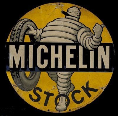
Here’s some trivial trivia for you: the “Michelin Man’s” actual name is Bibendum, and he used to smoke a cigar. Despite that nod toward the health-conscious 21st century, the inflated icon of French tire giant Michelin has had remarkable staying power for the past 121 years.
Bibendum might be a relic of early modernism, but the mascot-cum-logo has managed to survive by staying flexible. “Using specific characters was the trend [at the time],” design historian and curator Alain Weill said. “The little girl for Menier chocolate, the Pierrot for Cointreau etc…. The great thing with the chubby little man made out of tyres is that he could be represented in various situations – the different possible versions is my favorite point about him.”
London Underground
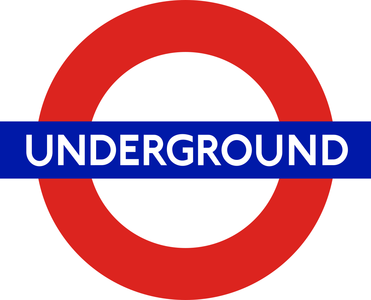
As much an icon for the London Underground as for the city itself, the bar-and-circle roundel debuted in 1908. In 1919 craftsman and calligrapher Edward Johnston altered the symbol’s proportions to the dimensions seen today, as well as designing the sans-serif typeface that was used until the 1980s.
The logo’s use of simple primary colors, as well as its interplay of basic geometric shapes, feels both universal and specific—the icon is now unmistakably that of the Tube. Much of that is thanks to British transport administrator Frank Pick, who saw the need for a strong identity from the Underground’s inception.
“Design is not a mode that enters in here and there and may be omitted elsewhere,” he said. “Design must enter everywhere.”
Target
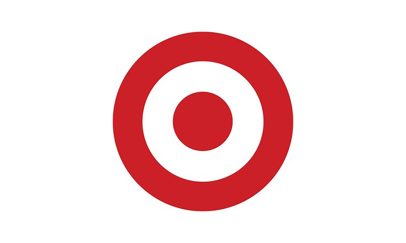
Alright, sure, someone asks you to design a logo for a company named Target, you’re probably going to design something with target-like. But there’s an elegant simplicity in the retailer’s 1968 logo, known as the Bullseye, that has allowed it to remain an enduring icon. A 2003 Target study found that 96% of American shoppers recognized the logo, and in 2006 the company decoupled the wordmark Target from the logo completely. Those three simple rings have all the playfulness of Pop Art while also requiring absolutely no decoding from the viewer.
Bass Ale
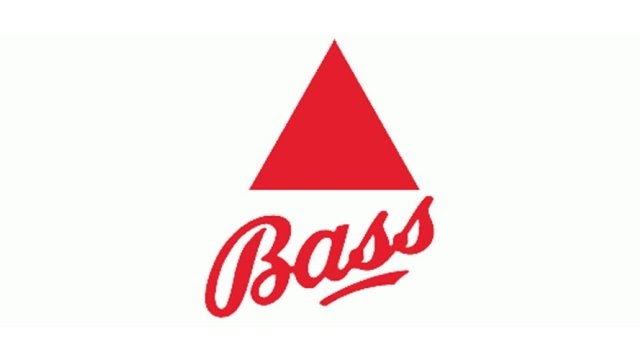
The world’s first registered trademark is also one of the best. In fact, this enduring icon has appeared in paintings by Manet and Picasso, gets name dropped in Ulysses, and went down with the Titanic—12,000 bottles worth. Trademarked in 1876, the Bass logo has not changed in all that time, even as the company itself went from being one of England’s crown jewels to just another feather in Anheuser-Busch-InBev.


