Government and good design don’t often go hand in hand, but when they do, the result can be a case study in efficient design systems. The announcement of a new U.S. government-created typeface is just the latest iteration.
When Richard Nixon signed the National Environmental Policy Act (NEPA, or EPA Act) of 1969 to help regulate industrialization and preserve natural resources in the United States, a component of its success relied on the ability to clearly communicate a cohesive new set of regulations or changes across hundreds of EPA offices around the county.
Previously, the agency had spent millions of dollars on informational brochures that lacked consistent color, type, size, and messaging. The result was a broken communication system that failed to deliver upon the agency’s mission. As a result, Nixon helped establish the “Federal Graphics Improvement Program” to raise the standard of design and communications of US government agencies.

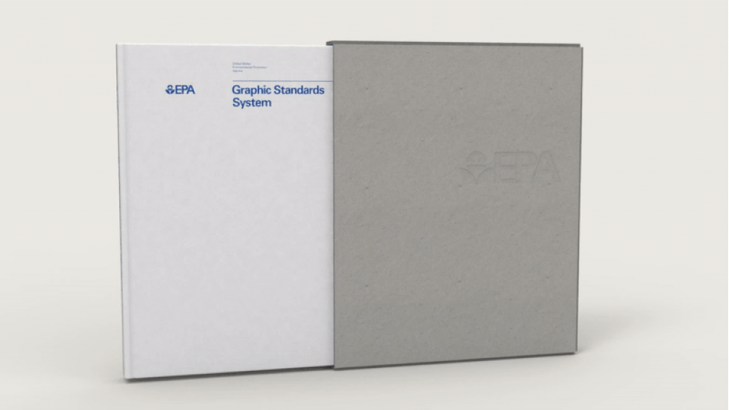
The program paved the way for the resulting EPA Graphics System, along with the NASA Graphics Standards Manual and the New York City Transit Authority Graphics Standards Manual. Each were created by leading design agencies at the time to provide a cohesive graphics communication system across hundreds, if not thousands, of agency touch points across the USA. All have since gone down in design history as benchmarks for outlining strict guidelines around identity as a function of efficient operation.
Today, design as a function of messaging is everywhere we look—both inside the government and out. But even after nearly five decades—through technology changes and roles in society—its function in government is still just as crucial as it ever was—if not more so.

With the recent announcement of the Public Sans typeface, the US government moves from merely defining logos on paper brochures to defining the readability of over 200 government websites—while creating a strict standard for high design in the process.
The typeface is a part of the U.S. Web Design System 2.0 (USWDS 2.0)—a sort of modern, web-based version of the graphics standards enacted back with Nixon. The system is a library of code, tools, and guidance to assist government teams in designing and building fast, accessible, mobile-friendly government websites backed by modern best practices. It currently powers everything from the Department of Homeland Security website to—yes, the EPA.
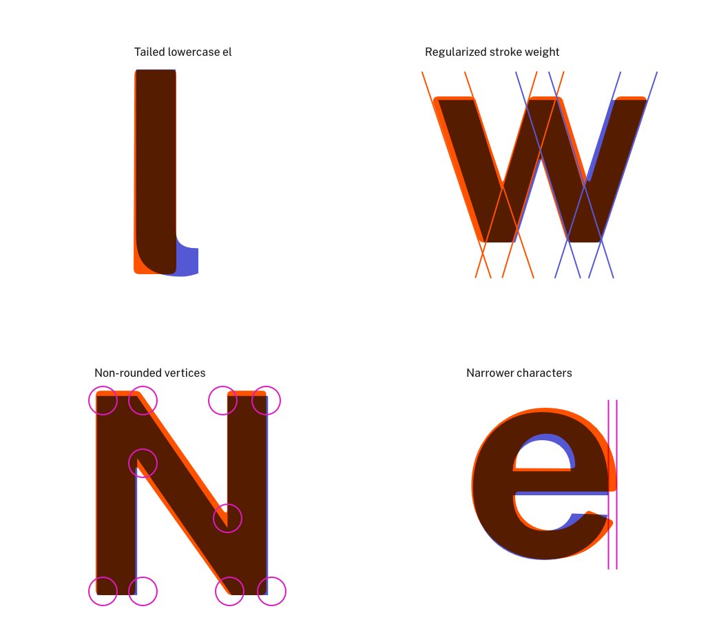
As an adaptation of the Libre Franklin typeface, an open-source variation of Franklin Gothic, Public Sans is designed to function well across multiple browsers and screen sizes. It ranges in weight from a mere 100 to a heavy 900—pending its use and needs across multiple applications. Previously, the US Web Design System made use of other open-source typefaces including the aforementioned Franklin Gothic, the widely-used Roboto and Source Sans Pro—all of which contributed to scattered graphics and, as a result, scattered messaging.

“Over the last two years, we’ve listened to the designers and developers using USWDS,” explains Dan O. Williams and Maya Benari of the United States Web Design System. “We’re proud that USWDS currently powers nearly 200 federal websites and we’re committed to making the design system work better for any federal website. With USWDS 2.0 we’re introducing a design system that’s built to grow with your needs — to help teams build better, more engaging websites for the American public.”
Learn more about the new typeface and USWDS 2.0 over at United States Web Design System.


