Recorded human civilization is now somewhere around 5000 years old, give-or-take a few centuries. While that means it’s increasingly difficult to create anything truly novel, it also means contemporary artists and designers have an impossibly deep well from which to borrow, remix, and mash-up. Of course, not all eras are created equal—nostalgia tends to be just as cyclical and trendy as anything else in modern culture. But here are three classic design movements that have more than earned their next moment in the sun.
Bauhaus
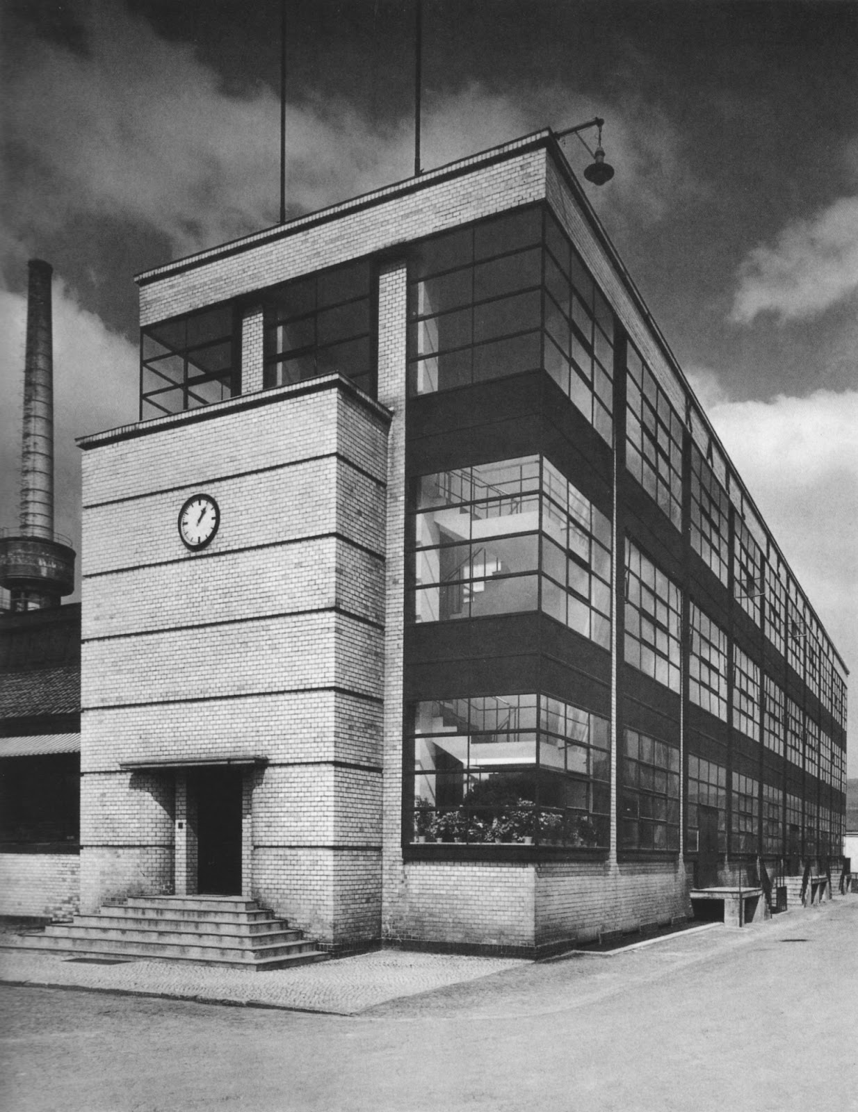
We’re celebrating the Bauhaus school’s 100th birthday this year, so it’s only fitting that the fine arts and design movement’s tenets make a comeback. Founded by Walter Gropius in Weimar, Germany, the “Staatliches Bauhaus” was a short-lived school that sought to unify art, craft, and technology. The resulting Bauhaus aesthetic favors an emphasis on functionality, balance, and simple geometric shapes. Consider László Moholy-Nagy’s Portfolio for Walter Gropius, or Gropius and Adolf Meyer’s Fagus-Werk Factory.
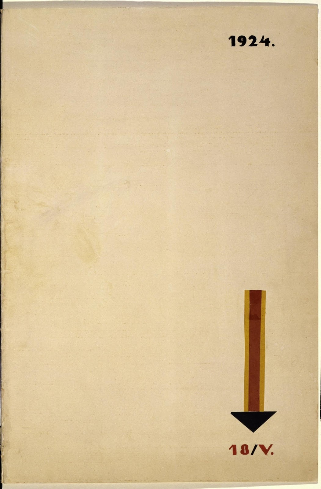
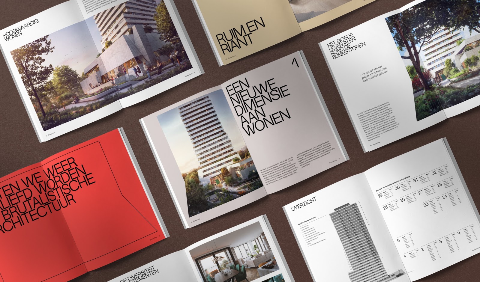
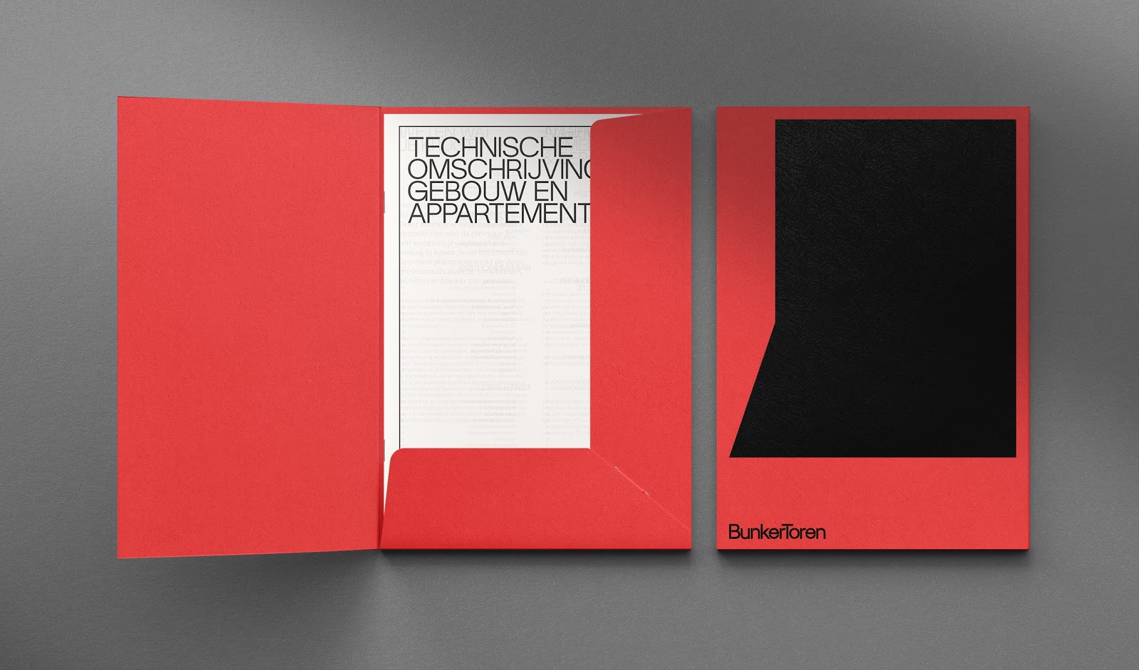
Today, Bauhaus’ reemerging popularity is seen largely in graphic design. Check out Netherlands-based design studio George&Harrison’s brand identity for Eindhoven’s Bunker Tower. As they explain, “The identity strikes a balance between raw and sophisticated, cultivating a monumental but classy aesthetic.”
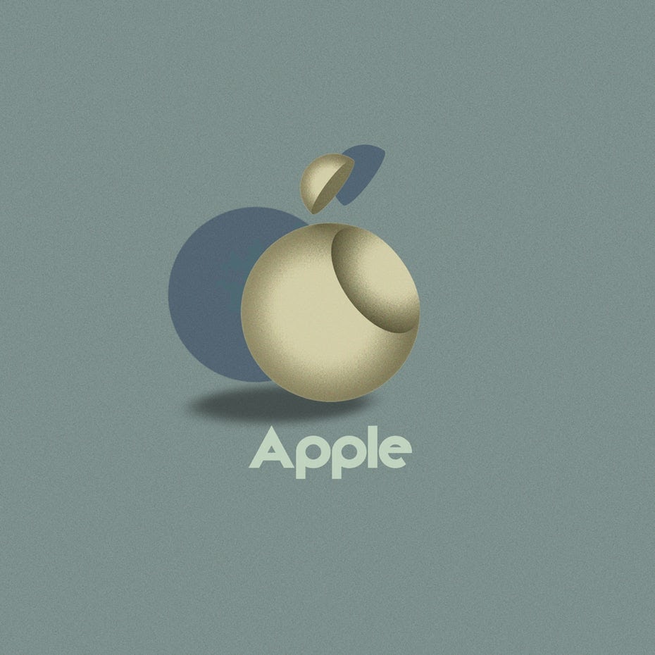
In celebration of Bauhaus’ centenary year, 99designs asked graphic designers to imagine contemporary logos with a Bauhaus twist. Among our favorites, dnk’s take on Instagram and Vladimir Nikolic’s backdated Apple logo.

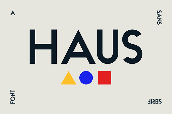
And the movement also lives on in typeface. Pier Francesco Martini’s HAUS Sans captures the school’s dedication to minimalism.
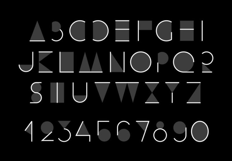
And Viktoryia Makouskaya’s Abstract Alphabet typeface embraces Bauhaus abstraction.
For more on the legacy of Bauhaus, check out Curbed’s interview with ten contemporary design leaders about the school’s lasting impact. (And if you need a primer, you can find it here. We won’t tell.)
8-Bit
We don’t have to delve all that deeply into the past to locate another retro design trend staging a comeback: 8-bit graphics. Of course when the 8-bit aesthetic came to prominence in the 1980s, the design wasn’t so much a question of choice but necessity—computer graphics simply weren’t capable of much better. The classics of that era are likely immediately recognizable.
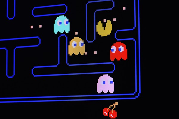
Think of contemporary 8-bit design as a haiku of sorts—the challenge is to create meaning, beauty, and memory within an intensely limited framework. The poor pixel resolution forces images to have a blocky quality, and the color palate is basic at best. In an RGB-color profile, 8-bit images allow for 256 tonal variations for each red, green, and blue; 16-bit images allow for 65,536 tonal variations in each. Despite those challenges, the look is showing up everywhere.
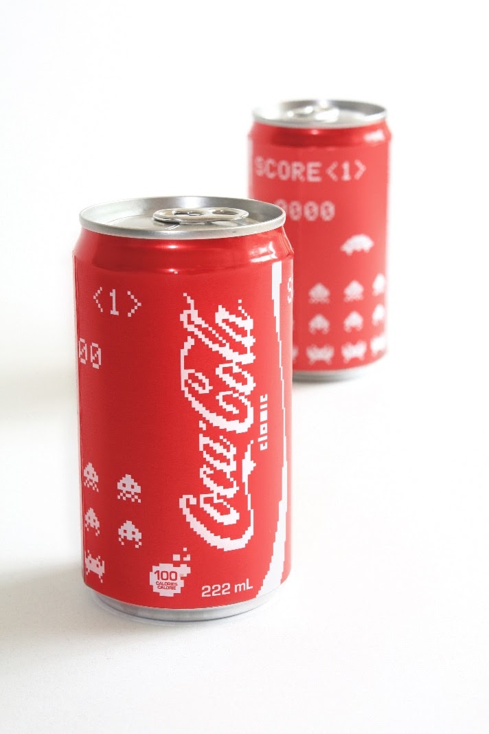
Check out Canadian designer Erin McGuire’s design for a limited edition set of Space Invaders-themed Coca Cola cans.
And it’s not impossible to embrace elegance with the pixelated 8-bit designs either. Loukas Chondros’ mark for the Greek candy Ousyra does just that.
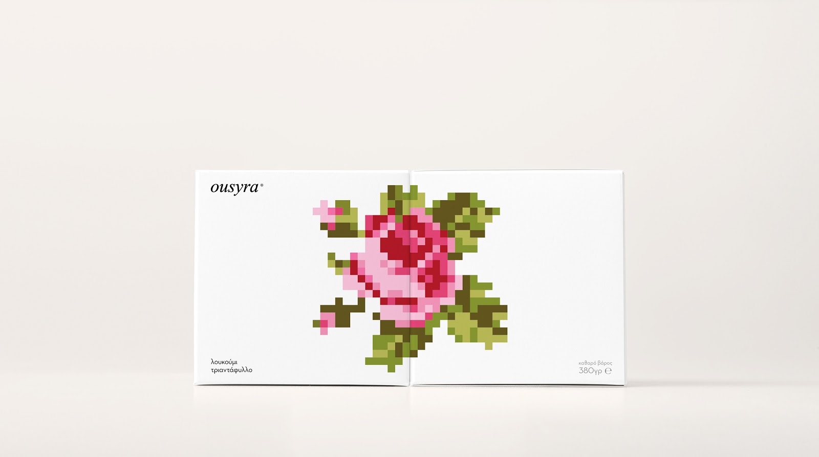
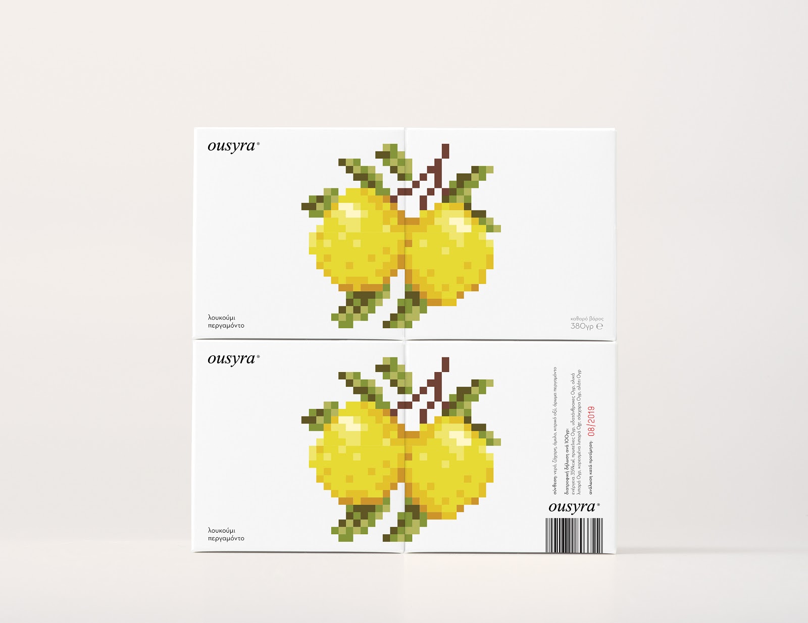
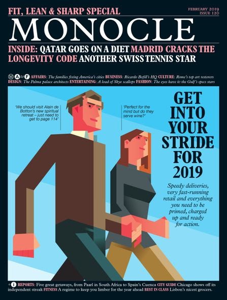
Hell, even Monocle is embracing our lo-fi heritage, as seen in this cover from February 2019.
Check out PBS’ short doc The Evolution of 8-bit Art to learn more about the burgeoning movement.
Art Deco
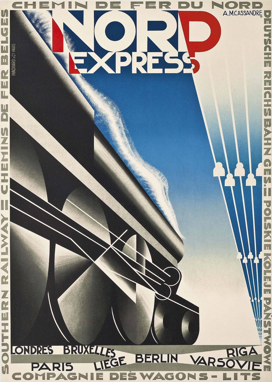
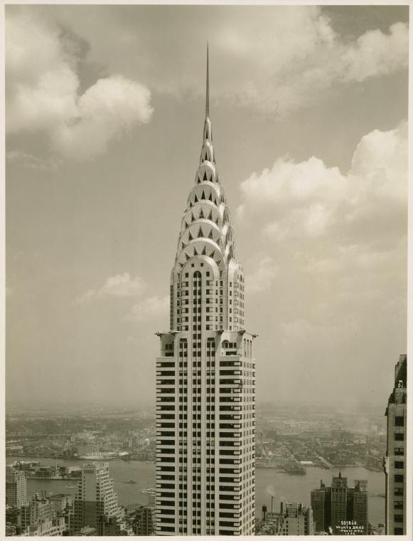
Like Bauhaus, the art deco movement emerged in the wake of World War I, coming to signify a very modern expression of conspicuous consumption. Forgoing Art Nouveau’s baroque aesthetic and soft curves for a more streamlined appearance, Art Deco favors bold geometric shapes, sharply diagonal typefaces, and a certain industrial fetishization, as seen in A.M. Cassandre’s “Nord Express” poster and William Van Alen’s Chrysler Building.
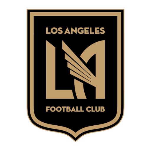
Today Art Deco’s influences can be seen everywhere, from the crest for the Los Angeles Football Club…
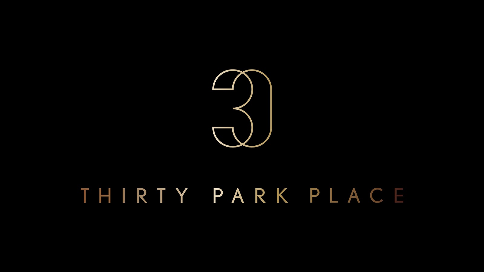
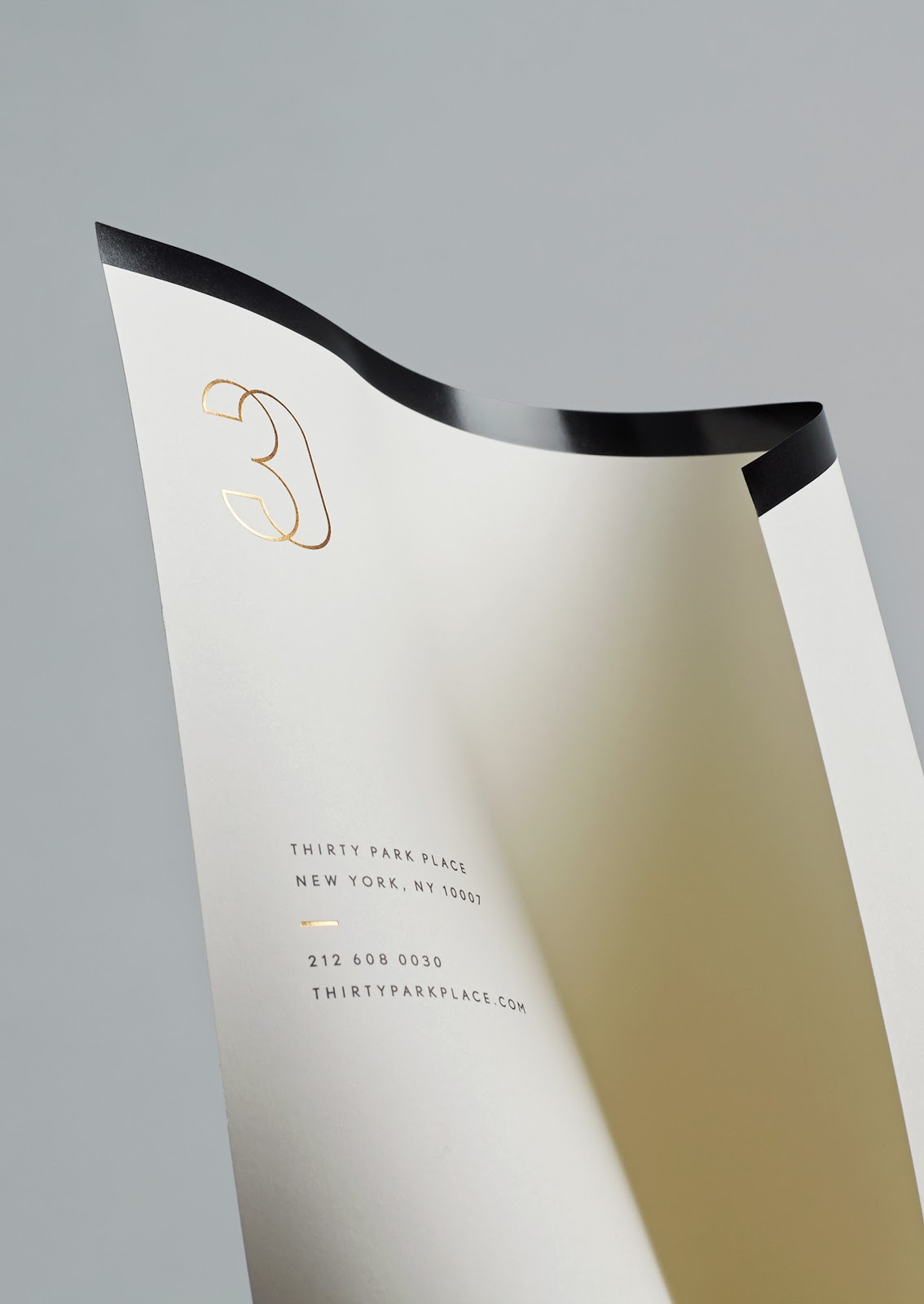
…to Mother Design’s identity for 30 Park Place.
