It’s no wonder the 61 designated parks and monuments of the National Park Service (NPS) have come to be considered some of the greatest features of the North American landscape. But who knew that national park posters, brochures, and maps were also such emblems of classic American graphic design? In his new book Parks, photographer Brian Kelley showcases his collection of 20th century NPS ephemera—over 300 maps, brochures, and infographics from the 1910s to the present day. Many of the posters were designed by uncredited artists, and they’re are as wildly divergent in design as the parks themselves.
When we think about the graphics of the NPS, most of us think of the materials based on a template designed by Massimo Vignelli and his wife, Lella. In 1977, the Vignellis developed a simple uniform system for the NPS called the Unigrid, which allowed for each park to determine how to present their own information and structure their maps in a standardized format. It was so successful, the system is still in use today.
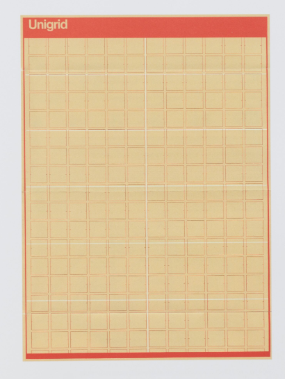
But before the Unigrid, each park had its own unique graphic identity. As Lyz Nagan-Powell explains in her introduction to Parks, these maps and pamphlets were considered physical manifestations of the various parks themselves. “They are brochures for the heart and soul of each destination,” she writes. “They tell the story of that place, and they mirror that place.”
Here are seven examples of unique NPS designs throughout the 20th century.
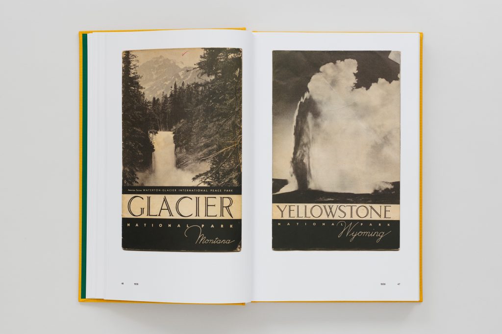
1939: Art Deco Brochures
Brochures for the parks started small. In the 1910s, when only 35 parks were federally recognized, individual parks would hire photographers to traipse through their land and document their beauty. Essentially, the purpose was to lure tourists to visit, and these brochures were part of early marketing efforts. That trend continued into the ’20s and ’30s, but because the parks did not have to justify their value to the American public, the designs took on a more stylized whimsy. In 1939, 19 brochures were made in this particular style, with large, art deco letters—double hairline strokes, dramatically thin terminals and tails—over black-and-white photographs of dramatic landscapes.
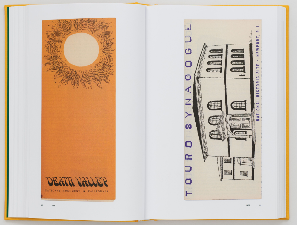
1965: Death Valley
In the 1960s, NPS brochures took on a different look. Experimentation with color, minimal graphic illustrations, and bold font choices became the convention. The NPS designs from this era are expressions of the graphic trends gripping the rest of the country. They’re emblematic of the visual style of ’60s America and this pamphlet from Death Valley, California is no exception. A large off-center sun, with wispy hand-drawn rays meant to evoke sunflower petals, shines down on an organically warped bubble font. It’s so quintessentially psychedelic, it could be on Jefferson Airplane album cover—all printed on the bright saffron of a monk’s robe. Doesn’t get much more “countercultural California” than that.
1966: Grand Canyon
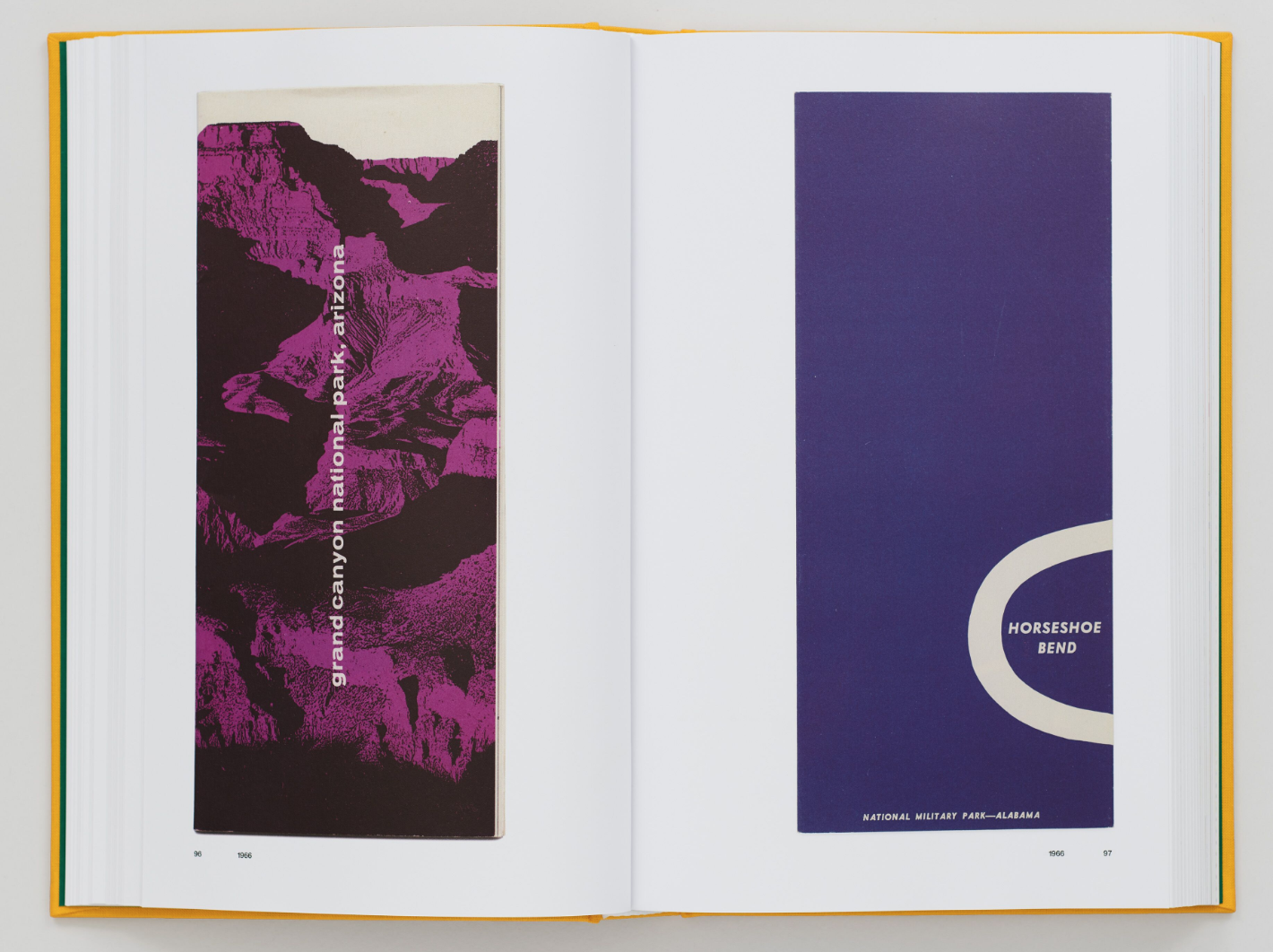
The Grand Canyon was intended to be the third national park, after Yellowstone and Mackinac, but the bill failed in the Senate in 1882. It took another 30-plus years before the Grand Canyon was added to the NPS in 1919. The above brochure, printed in 1966, displays the rust red tributary canyons and ravines along the Colorado River in a dramatic, deep purple—with a blocky, bulbous white sans serif splashed in a lowercase across the landscape. This particular color, electric purple, might be a reference to the magenta seen commonly in infrared color photography, which gained in popularity in the ’60s thanks to Kodak’s Aerochrome. Infrared film, originally developed for use by the military, processed all greens—including the greenery of mountains and valleys—in purple.
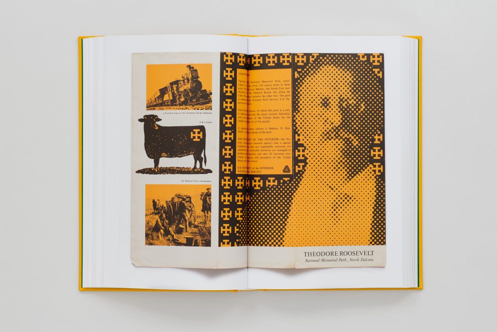
1967: Theodore Roosevelt’s Maltese Cross
This op-art brochure for Theodore Roosevelt National Memorial Park, which covers over 70,000 acres of badlands in North Dakota, is marked by one of the President’s own brands, a blocky Maltese cross. Roosevelt used the mark to distinguish his livestock as a rancher. He owned two open-range ranches in the Dakota territory, and used three brands to mark his herds. The graphic impact of repeating the brand mark within the folds of the brochure not only helps to define the pixelated form of Roosevelt, giving his outline definition, but it also transmits the importance of the cross to the maintenance of the ranch and to the history of Roosevelt’s park itself.
1968: Cape Cod
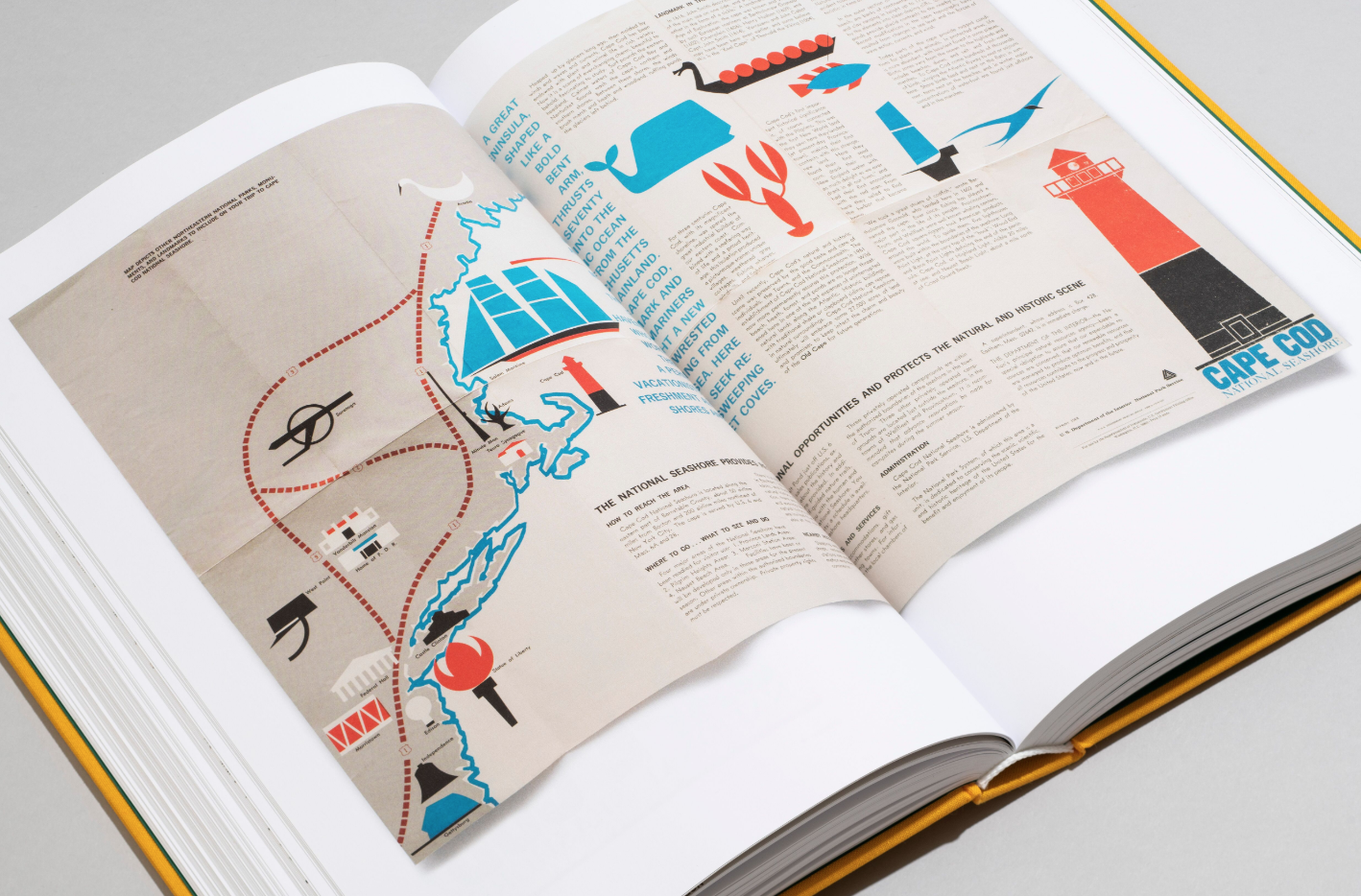
Cape Cod, Massachusetts has a deep, illustrious history and connection with modernism. It was a draw for some of the greatest visual artists and architects in the 20th century, including Bauhaus founder Walter Gropius, designer and architect Marcel Breuer, and artists György and Juliet Kepes. The uncredited designer of this infographic for the Cape Cod National Seashore, established in 1961 by President John F. Kennedy, might have been paying subtle homage to the visual history of the region with blocky, informational icons and a Bauhaus color scheme of blue, red, and black.
1976: Yellowstone Safety Brochure
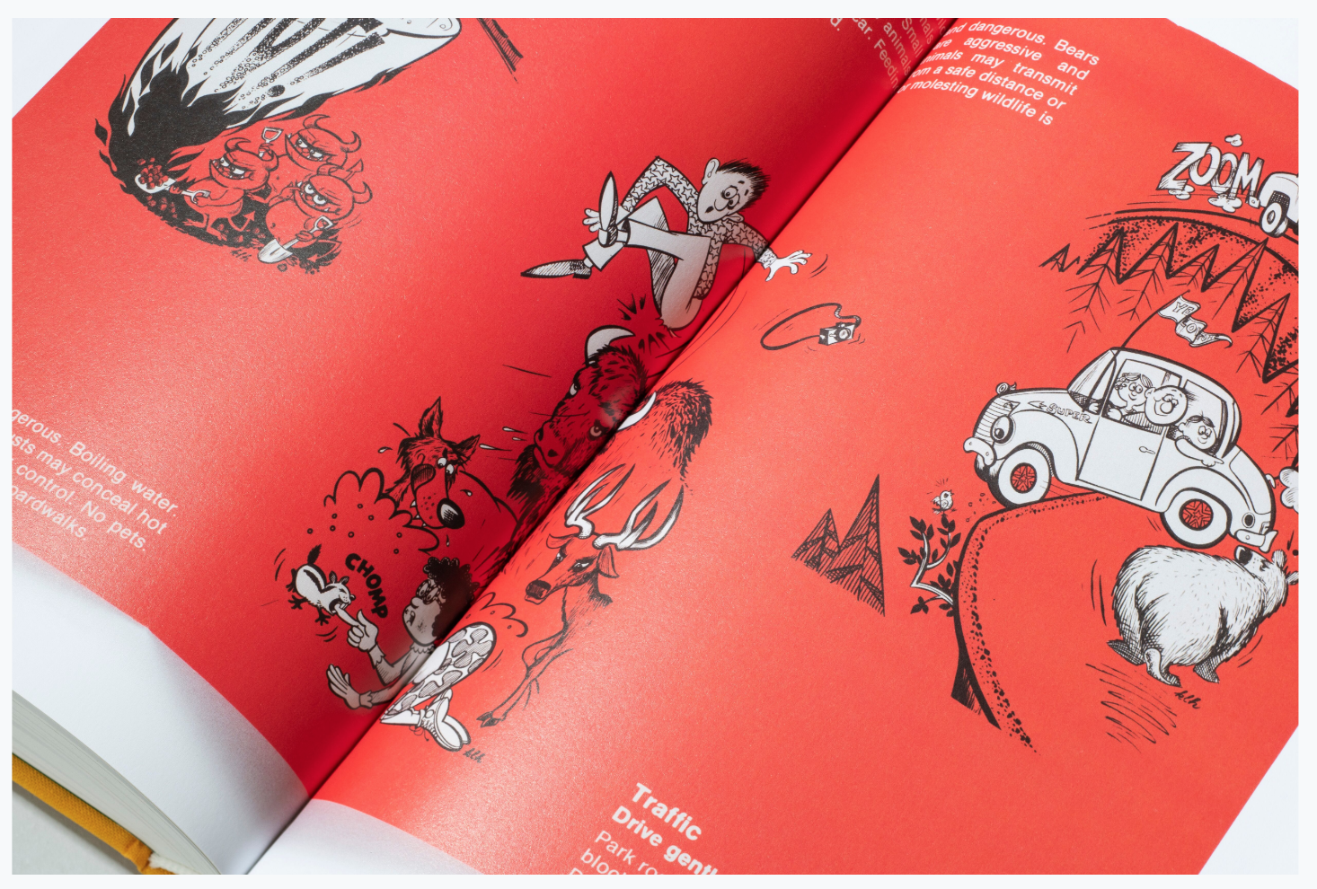
This brochure from Yellowstone, the country’s first national park in 1872, warns of the hazards of backcountry travel with cartoonish illustrations. Advisories on risky interactions with wildlife—bison, elk, grizzly bears—and the deadly geothermal hot springs are paired with simple, playful ink drawings on a bright red page. Imagine Dr. Seuss doing comic strips. This brochure is wildly eye-catching and accessible for a reason: Yellowstone is the deadliest of the parks, with fatal rockfalls, geothermal burns, and grizzly bear attacks happening each year.
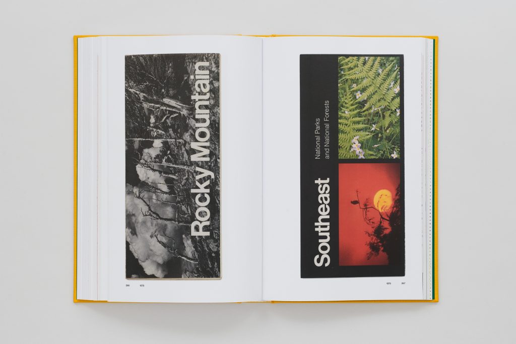
1978: Unigrid Maps
These two early examples of the Vignellis’ NPS template show how adaptable the Unigrid’s organizing principles were. While all NPS materials were required to organize their graphic and editorial content by 12 formats, all of which could be designed on the same grid, there was still plenty of room for unique aesthetic choices. Take the brochure for the Rocky Mountain National Park, which has a large right-aligned title on top of a black-and-white full-bleed photograph. For this brochure, the designer made the aesthetic choice to abandon the iconic thick black bar that often framed the title, in order to dramatize the photograph. But the font is the standard house font: Helvetica. Vignelli also used Helvetica in another one of his massive public undertakings: the New York City Subway.
The future of the NPS map
Kelley’s collection is a reminder that the NPS is about so much more than just wild country and hiking trails: It’s about information, and history. These brochures speak to the complicated system that goes into maintaining and preserving these wild landscapes, which welcome over 300 million visitors a year. “There is… so much history beyond the wonders of the landscapes,” said Kelley. “These pieces begin to peel back those layers and allow readers to see the system’s evolution in a whole new way.”
The book is also a perfect encapsulation of the pre-digital park system, one that we’re rapidly leaving behind. As Nagan-Powell explains, printed matter carries a different meaning in the digital age—and emerging technologies are taking the place of many NPS materials. But if anything, Nagan-Powell argues, these older manuals and brochures take on greater significance as we leave the 20th century behind: They become “time capsules,” as she calls them, “represent[ing] a visceral, physical story of a moment in time.”


