Illustrator and designer Rocky Roark was four-years-old when he managed to turn a profit on a magazine of his own design. His reputation at having a knack for the business of design has only grown since, as the 29-year-old navigated the complex world of freelance design and illustration.
Today, the client list at Roark’s Blue Cyclops Design Co. reads like a Silicon Valley VC’s dream portfolio: Google, Facebook, Adobe, Box, Intuit, among many others. As the host of the Design Break podcast, he has also garnered a large following of fellow designers and illustrators on Instagram, Dribbble, and YouTube, where he regularly posts inspiring and educational content that reminds other designers to be “passionate, positive, and creative” in their design and business endeavors.
We caught up with him to learn more about how he approaches working with clients, how he maps out his design process, and the advice he has for those thinking about setting out on their path as freelance designers.
Rocky! So how did you land in the wonderful world of design and illustration?
I remember going into the high school classroom and seeing printers and screen printing equipment and iMacs and I was like…’What the heck did I just sign up for?’
Quite by accident, actually. I was in middle school, signing up for high school classes and I saw this class called Graphic Communications. I had no idea what the heck it was. My student advisor had no idea either and told me it was actually Game Design, which I thought was pretty cool so decided to try it. I remember going into the high school classroom and seeing printers and screen printing equipment and iMacs and I was like…”What the heck did I just sign up for?”
I ended up taking that class the maximum amount of times you could take it—eight times over my four years in high school. [laughs]. I basically became the go-to person for all of the graphic design and posters, not only for the high school but for the school district. Any type of flyers and things that went out, I created. Because of that, I got my first job in design, at a print shop in my hometown. The 2007 recession hit and my mom lost her job, so I worked there for about six months to eight months during school. And then during the summertime, I worked anywhere from 40 to 60 hours a week. So, before I even started at university for design and illustration, I had a lot of experience under my belt.

Do you think a modern design education is something that’s better learned at a university or on your own?
You just need to be able to communicate what you can do and be able to articulate the process of how you solve design problems.
I think that university is not for everybody. There are so many universities out there that do it right; they have professors who are either working in the field currently and working part-time as an educator or are otherwise just still very involved in the modern world of design still. But then there are a lot of universities that don’t have educators that have been keeping up with the times. And if the end goal is to have a physical portfolio that’s relevant to modern businesses, I don’t know if that pathway is entirely relevant anymore. In fact, after talking to people with authority in and thought leadership in the matter, I don’t really care too much about the physical portfolio many educators still teach you to develop in university. I don’t even think you need a website for that matter, which they are also teaching. Rather, you just need to be able to communicate what you can do and be able to articulate the process of how you solve design problems. Again, some people may need university experience to put together a few sample projects that show their design process, but a lot of people could probably figure out how to teach themselves without it, too.

Your first big freelance project was while you were still in school at Georgia Southern University, and it was creating the design for the (now infamous) party game Cards Against Humanity. How did this happen?
I was really into this campus game called Humans versus Zombies, which is sort of like Capture the Flag with Nerf blasters set against a zombie apocalypse narrative. I started creating these Humans versus Zombies propaganda posters to promote the meetups and hung them all around campus. One day I got an email from Max Tompkiins, who would later become one of the co-founders of Cards Against Humanity. He said, “Hey we love your posters, can we jump on a call and talk?” So that led me down the path towards doing some other side projects of theirs, one of which was Cards Against Humanity. Before I started the project, Max asked me whether I wanted 2% or something of the revenue or $500 flat-fee. Since Humans versus Zombies was making no money whatsoever, I chose the $500 because I wanted to buy my mom a nice Christmas present. Now, whenever I see the game at Target or some big box store I think that was maybe a bad business decision. [laughs]
What sort of tools do you use in a typical design process?
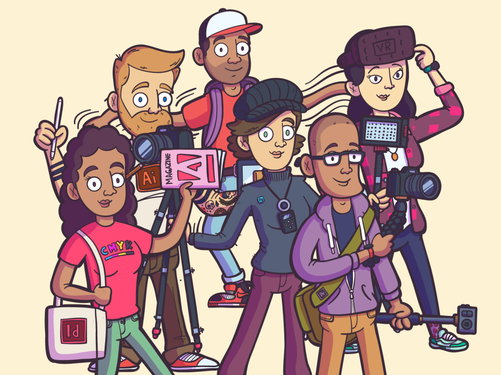
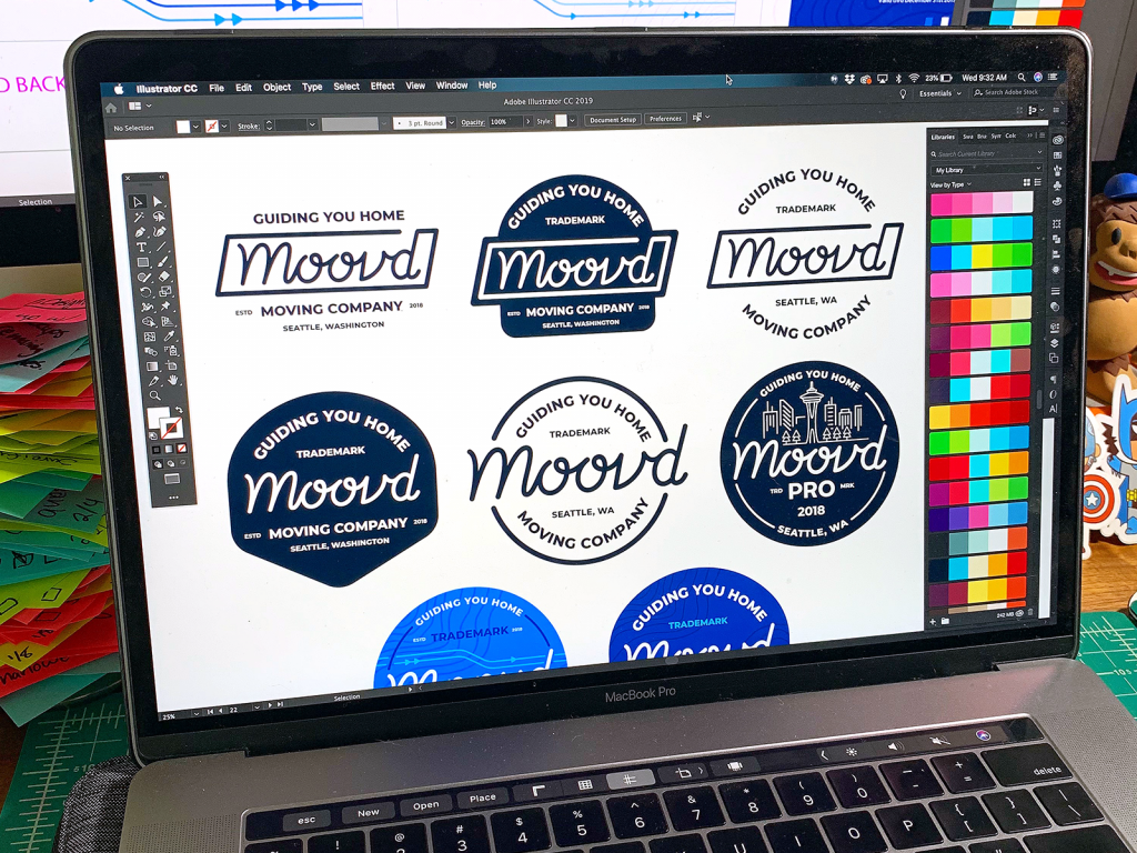
So all of all the software that I use is pretty much Adobe software. I’m a huge Adobe fan. In fact, they just had me on Adobe Live a couple of weeks ago. Also, of course, I use Apple and start a lot of my sketches on an iPad Pro.
As for the design process, when I start talking with clients I include a ton of strategy in the discussion because I’ve found that it helps prevent rounds and rounds of revisions, which I try to avoid. Some designers or illustrators are okay with that, but I try to make the project as clear and as streamlined as possible from the get-go. So when I start a project, you know, sometimes the client will provide a creative brief, or sometimes I have to write it in Google Docs and have them sign off on it but before I even start sketching at all. This step is important because if you came to me and asked me to illustrate a dog, what you perceive as a dog is different than what I might perceive as a dog. You could be thinking of a Saint Bernard while I could be thinking about a Corgi, and so we kind of need that level of alignment so we don’t have to go back and completely change things later on that may otherwise seem obvious.
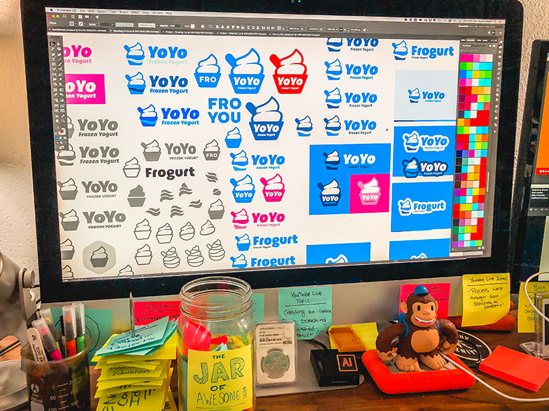
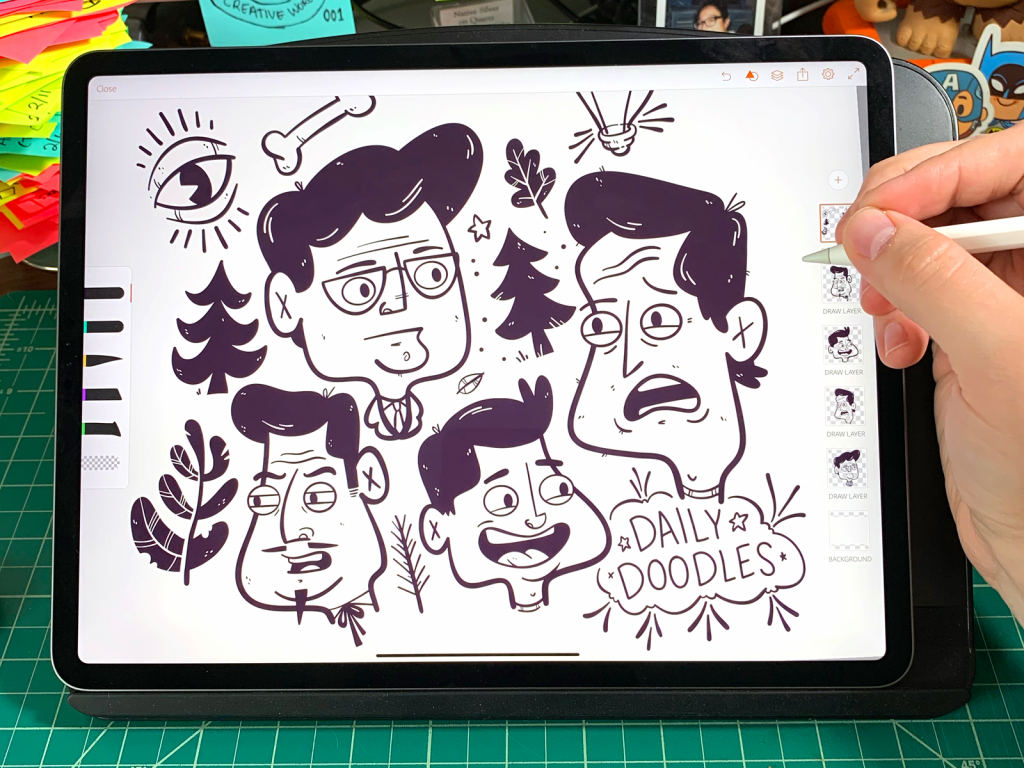
And so once I get all the granular information and the brief is signed off, I start the initial sketching phase and from there I go into creating greyscale illustrations either on the iPad Pro or directly in Adobe Illustrator using a lot of simple shapes and the Pathfinder tool. I do greyscale first because I don’t want my clients focusing on color at this stage, because it can derail the concept work. Once the greyscales are approved, I’ll move onto color tracing and get approval for that before I move onto finalizations and hand the finished project with specs back to the client.
And how would you define your distinctive visual style? Where does the inspiration come from?
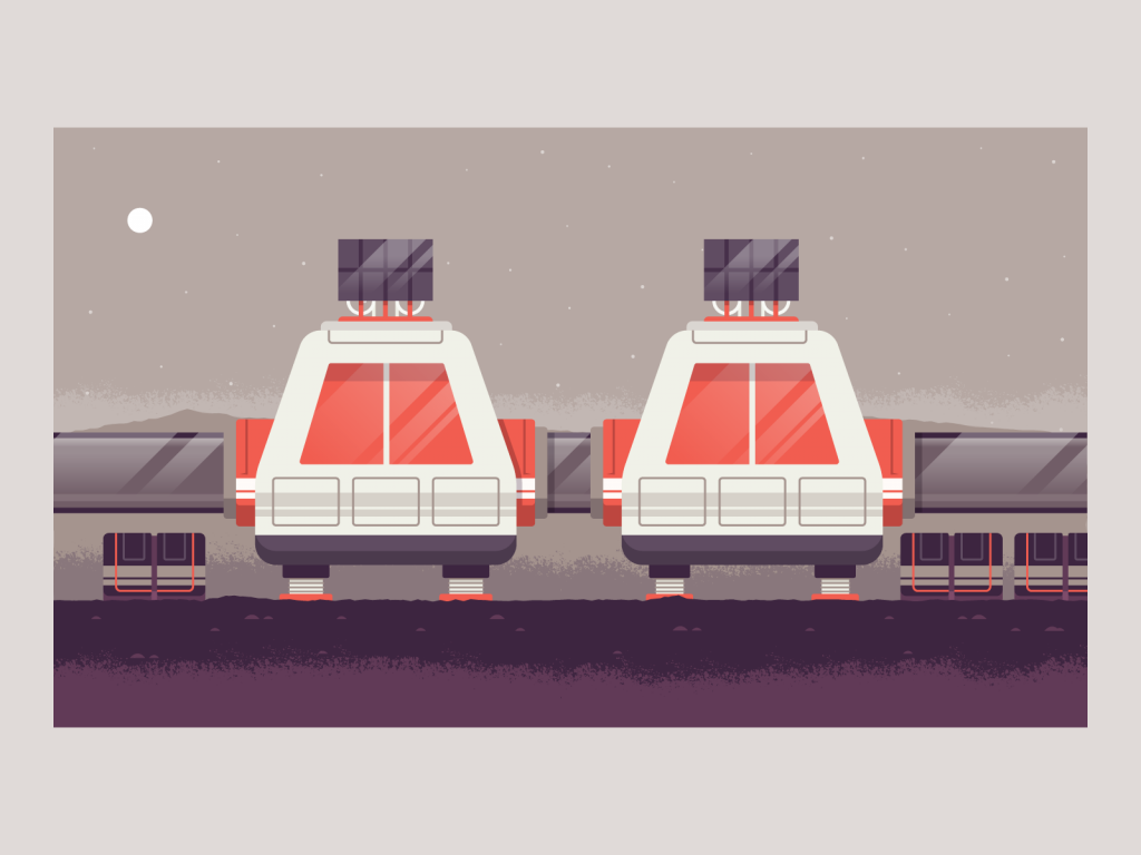
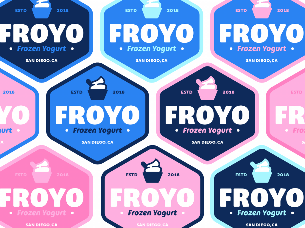
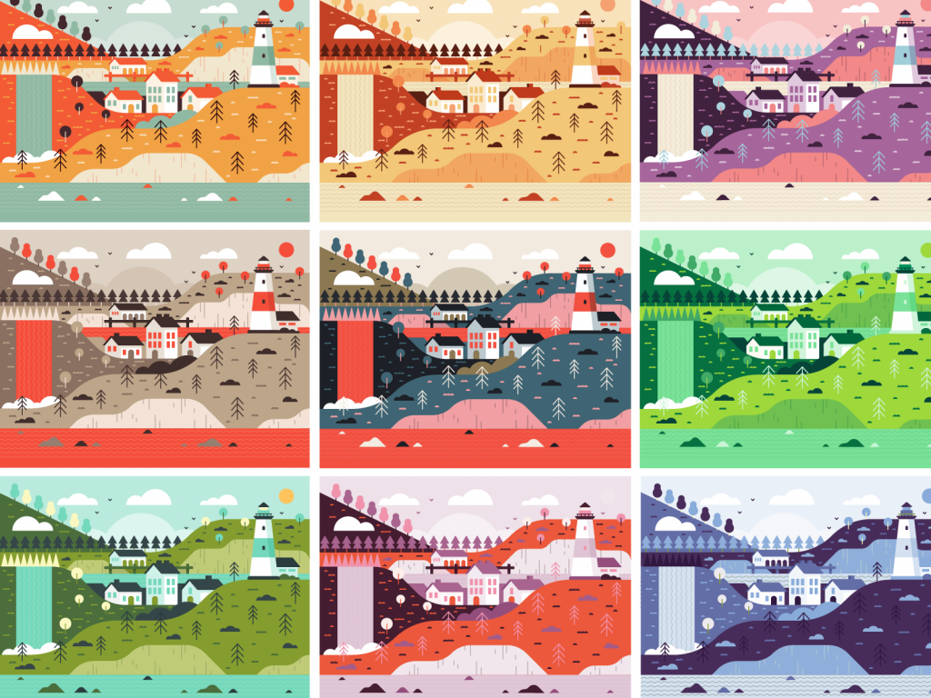
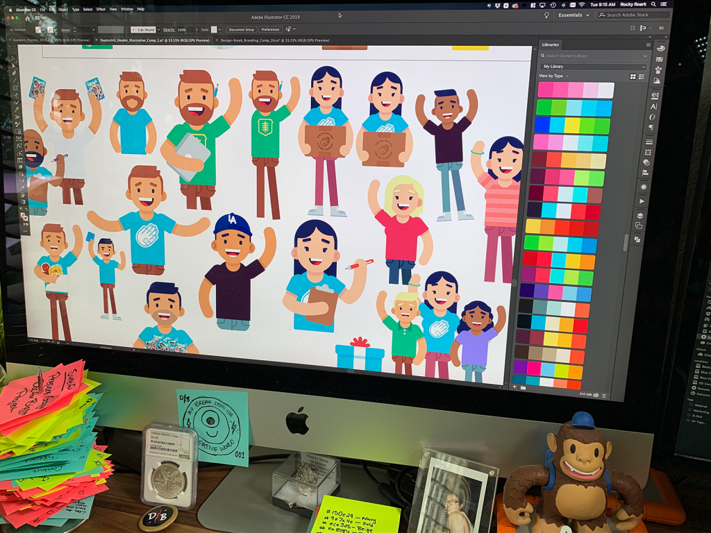
I think the work I’ve done that has been the most recognizable is recognizable in some part due to my use of color. I spend a lot of time on colors—making sure they really pop, whether on a t-shirt, a web page, or an advertisement campaign. That’s also one of the things people always tell me—that they say they really like my use of color.
I wouldn’t necessarily call it ‘playful’, but there is definitely a sort of whimsical element to most of what I do.
– Rocky Roark
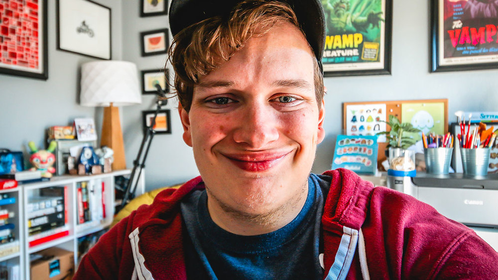
I’ve got tons of color elements throughout my home studio; toys everywhere and brightly colored prints. I surround myself with color for inspiration because I find that it can be the most impactful element in an already-amazing logo design or illustration or anything else. Because, I mean, if the color falls short, no matter how great your design is, it can sort of derail the whole thing. Aside from that, I like to have fun with my work. I wouldn’t necessarily call it “playful”, but there is definitely a sort of whimsical element to most of what I do.
You’ve developed a strong presence on social media. How did that come about?
You know, I think it’s because I don’t really talk to people with an ego or with this like, you know, “I’m better than you” type of mentality or tone. I think that’s the reason why a lot of people, a lot of creators, especially young creatives, you know, follow me and they love what I talk about and the thing is, whenever I post content, whether it’s on Dribble, Instagram, the Podcast, or YouTube, I always try and give some sort of nugget of wisdom at least one thing in the video that would potentially help someone just like how I was at age 17 or age 20 or whatever.
Always stay creative about what you’re doing and what you’re making and the ways in which you tackle problems.
– Rocky Roark
And I always end with three words in all of my content, and that’s to stay passionate, positive, and creative. And those words sort of sum up my philosophy: you should always be passionate about what you’re doing. And when you realize that you’re not passionate about something, then you need to make some sort of change. You should always be positive because even in the darkest times there is some sort of light. You know, if you get fired from a job, OK, you’ll find a better job or you’ll find some side work for yourself. And always stay creative about what you’re doing and what you’re making and the ways in which you tackle problems.
When I first started saying those words, it was just something catchy to have at the end of a video. But then eventually I started to realize I live my life by those three words and they have gained a lot more meaning for me over time.
What sort of advice do you have for those recently graduating or those looking to switch up their career with freelance design or illustration work?
Always start freelancing as a side hustle—don’t just go all-in. I always recommend doing two or three freelance projects at a time while you have a full-time job so that you always have a fallback. From there, once you start to build up a list of clients, it becomes easier to jump into freelance full-time with a wider network.
In all honesty, I learned more in three months at an agency out of college than I did in all four years of classes.
As for recent design school graduates, I would do anything to get a job before going straight into freelance. This will both give you a fallback and a new dimension with real-world experience that likely wasn’t taught in a university. In all honesty, I learned more in three months at an agency out of college than I did in all four years of classes.

So, what’s next for you, Rocky?
I got super busy this year but I’m going to be bringing back my podcast, Design Break, and posting more videos to my YouTube channel. I’m also going to be shifting from illustration to do more branding projects with my new company, Blue Cyclops. It’s my biggest project right now and it’s a whole mess.

Learn more about Rocky and Blue Cyclops by heading over to RockyRoark.com.


