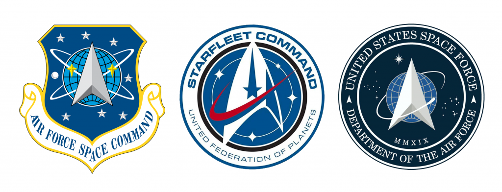
This past December, President Donald Trump signed the National Defense Authorization Act, formally creating the Space Force, a sixth branch of the U.S. military dedicated to defense of the country’s assets and interests in outer space.
“History proves that peace only comes through strength,” Vice President Mike Pence said of the new branch in 2018. “And in the realm of outer space, the United States Space Force will be that strength.”
The administration took a big, or at least visible, step toward making that a reality on Friday, when it released the logo and branding for the new department. After all, what’s a business without a brand?
Hmmmm. Well, that looks… familiar. Where have we seen this before?
Allow Hikaru Sulu to make the connection:
Indeed, the logo bears similarities to the logo of Star Trek’s Starfleet Command. From the color schemes, to the central upward-facing arrow, to the globe with an object in orbit and the stars in the background, to the name in a circular ring around the logo, there are more than a few commonalities.
But did the government—as critics charge—just change a couple colors, move a couple lines around, and call an iconic logo its own? It seems too absurd to be true, but then again, this is an administration that lied about crowd size at an inauguration and altered a weather service map with a Sharpie.
While the logo certainly resembles one belonging to the Starfleet Command, the new Space Force logo more closely resembles the one for its space-defending predecessor. The Air Force Space Command was a major branch of the U.S. Air Force, which was incorporated and rebranded as the independent Space Force in December. Its logo, designed in 1982, features many of the same components as the new one.
Former Air Force Lieutenant John Noonan highlighted this existing logo and the way it inspired Trump’s Space Force logo.
Though the colors have been tweaked and some other minor cosmetic changes have been made over the years, the Space Force logo appears mostly the same as it did almost 40 years ago.
After a quick Google search, Noonan’s account checks out: Mike Okuda, the graphic designer who created the insignia for Starfleet, says it first appeared in a 1996 episode of Star Trek: Deep Space Nine. That’d be a full 12 years after the Air Force Space Command debuted its logo. Furthermore, according to Okuda, the Starfleet logo was designed with the emblem of NASA in mind. So, while the similarities are there, it appears Star Trek borrowed from the government, not the other way around.

So, was the hysteria worth it? As is the case with all instances of Internet outrage, probably not. Please continue with your day—live long and prosper.


