When it came to the design world, there was plenty to bring good cheer this December. Here are a few of our favorite design-related stories to carry us over into the next decade.
In the Box Seat

You might know Donttakethisthewrongway, the design firm based in Savannah, GA, because of the splash they made earlier this year with the public punching bags they peppered throughout New York City, supposedly to help with city residents’ stress. They’re back with yet another cheeky design concept: A chair made from a cardboard box. They’ve been built to last—“overengineered,” as the firm’s website says—coated in a water repellant, given a dent-proof top cushion, and reinforced to handle 350 lbs—also, they’re for sale.
Tangled Up in Blue
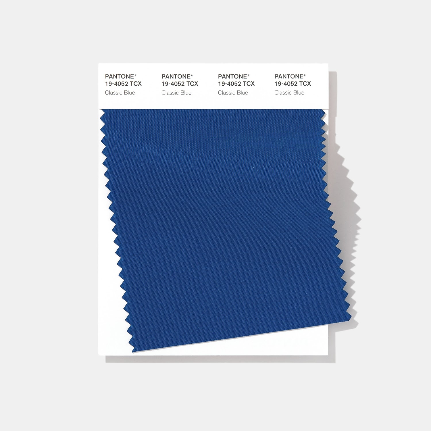
If Pantone’s newest Color of the Year isn’t doing it for you, you’re not alone. In Evan Nicole Brown’s venomous assessment of Classic Blue, she argues that this particular shade, while meant to be “soothing” and “familiar” in a time of transition, is aggressively banal. She makes the comparison of Classic Blue to tech logos—Facebook and Google Docs are prime examples—and suggests that the association is an implicit suggestion of the digital oligarchy’s power in our lives: “A vivid blue reminder of data surveillance and the tireless demands of work in 2019 doesn’t exactly soothe the soul.”
A Font with a Backbeat
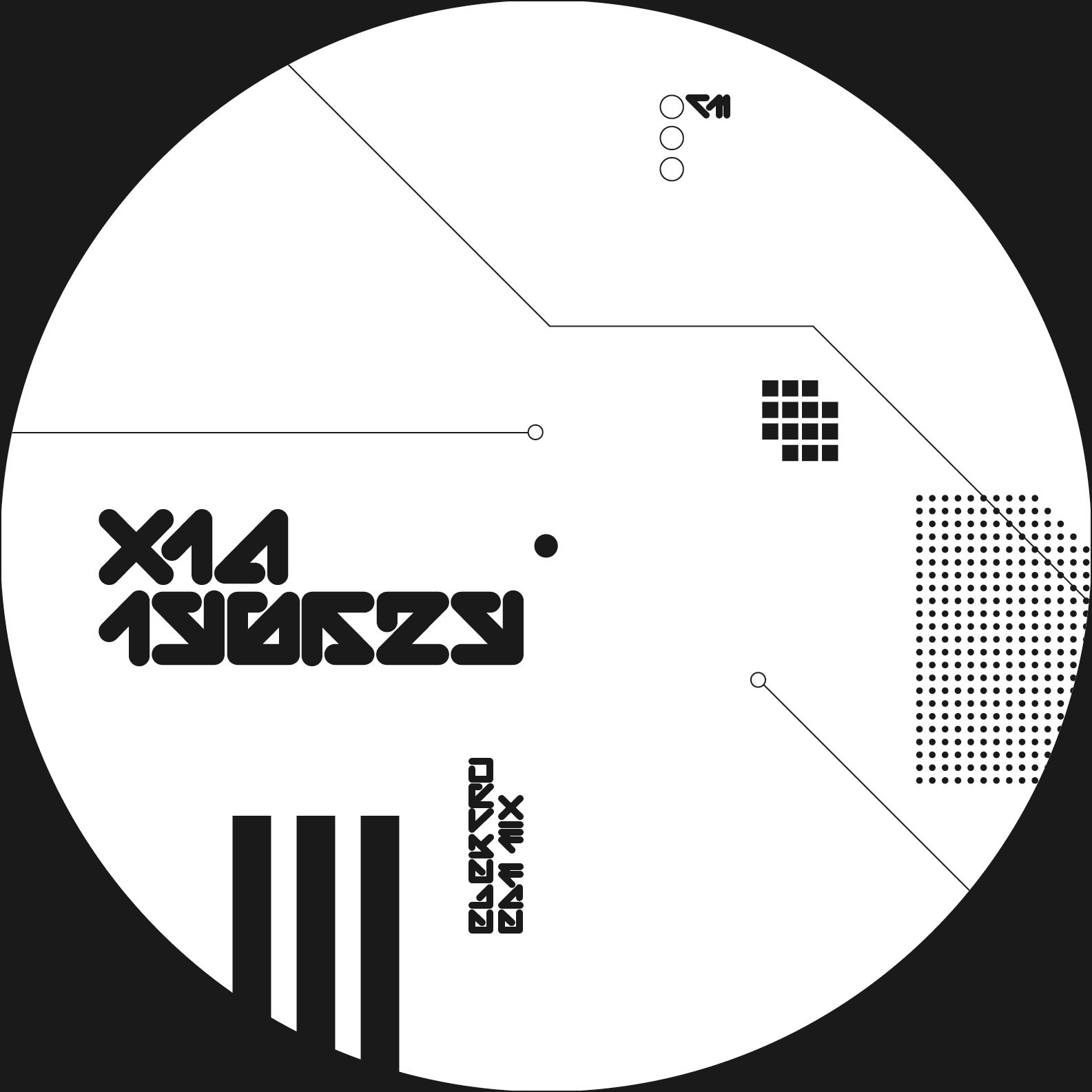
For you technophiles, there’s a new typeface fit for the club, or more accurately, for the record sleeve. AIGA Eye on Design spoke with graphic designer Aron Fay about his love for futuristic monotypes found on ’90s albums and their influence on his own typeface, TRI.
The typeface, which gets its name from the minimalist triangular letterforms that make up the backbone of the entire font, was created to establish a unified visual system for Fay’s own music projects. He releases these under the name x1a (after the PDF export preset from the aughts).
A Master Plan on Burning Man
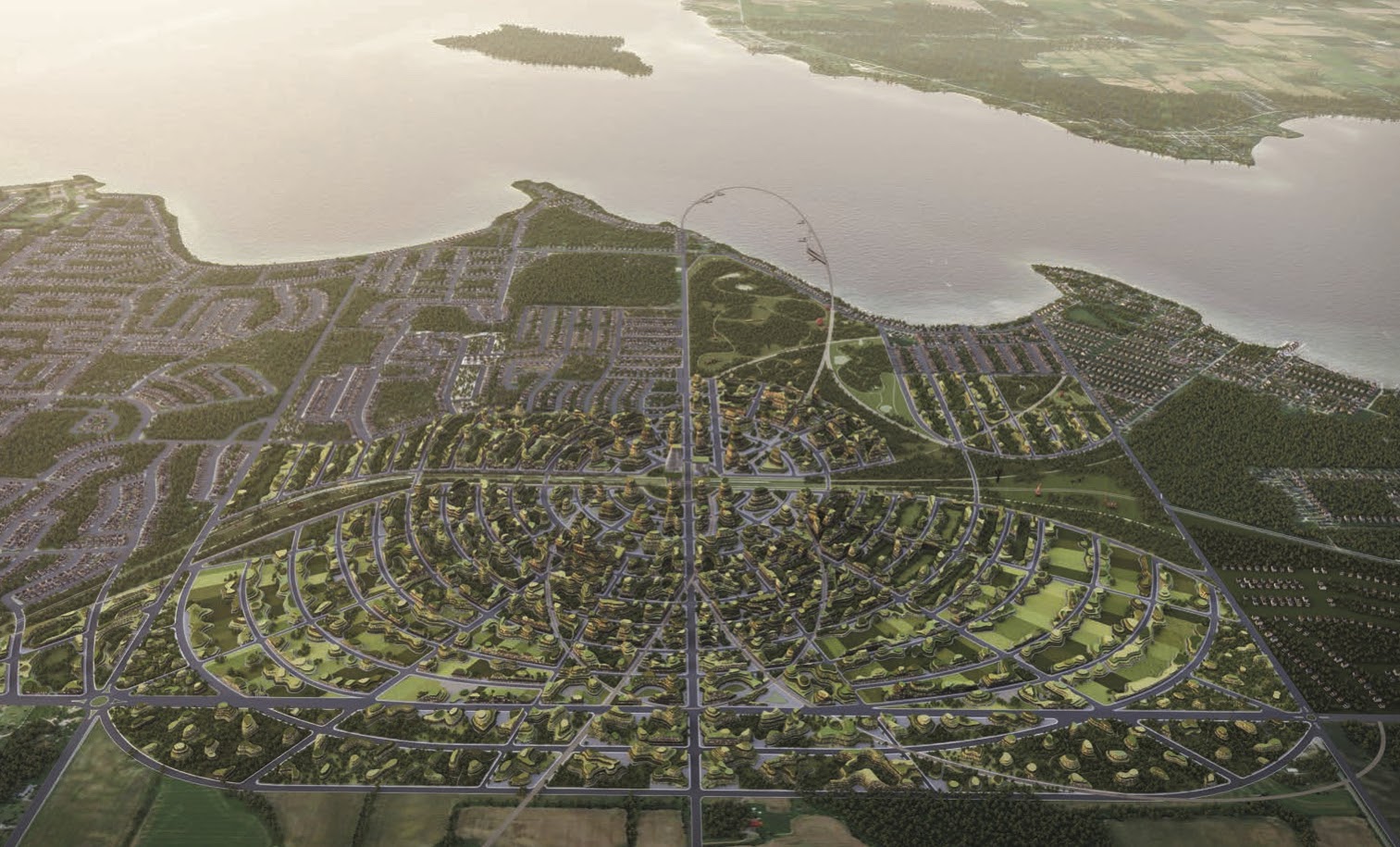
Organization probably isn’t the first thing that comes to mind when you think of Burning Man, the wild annual summer bacchanal in the Nevada desert, but maybe it should be. The Toronto-based architects Partisans have revealed a masterplan to transform Innisfil, a rural town in Canada, into a “city of the future”—using the same design principles of Burning Man’s city, The Playa in Black Rock City. Instead of using a square grid layout, Partisans have mapped the city plans onto concentric circles, like an old European city, but with a modern twist. Because instead of a church at the center of this city, there’s going to be a high-tech rail system.
It All Comes Out in the Wash
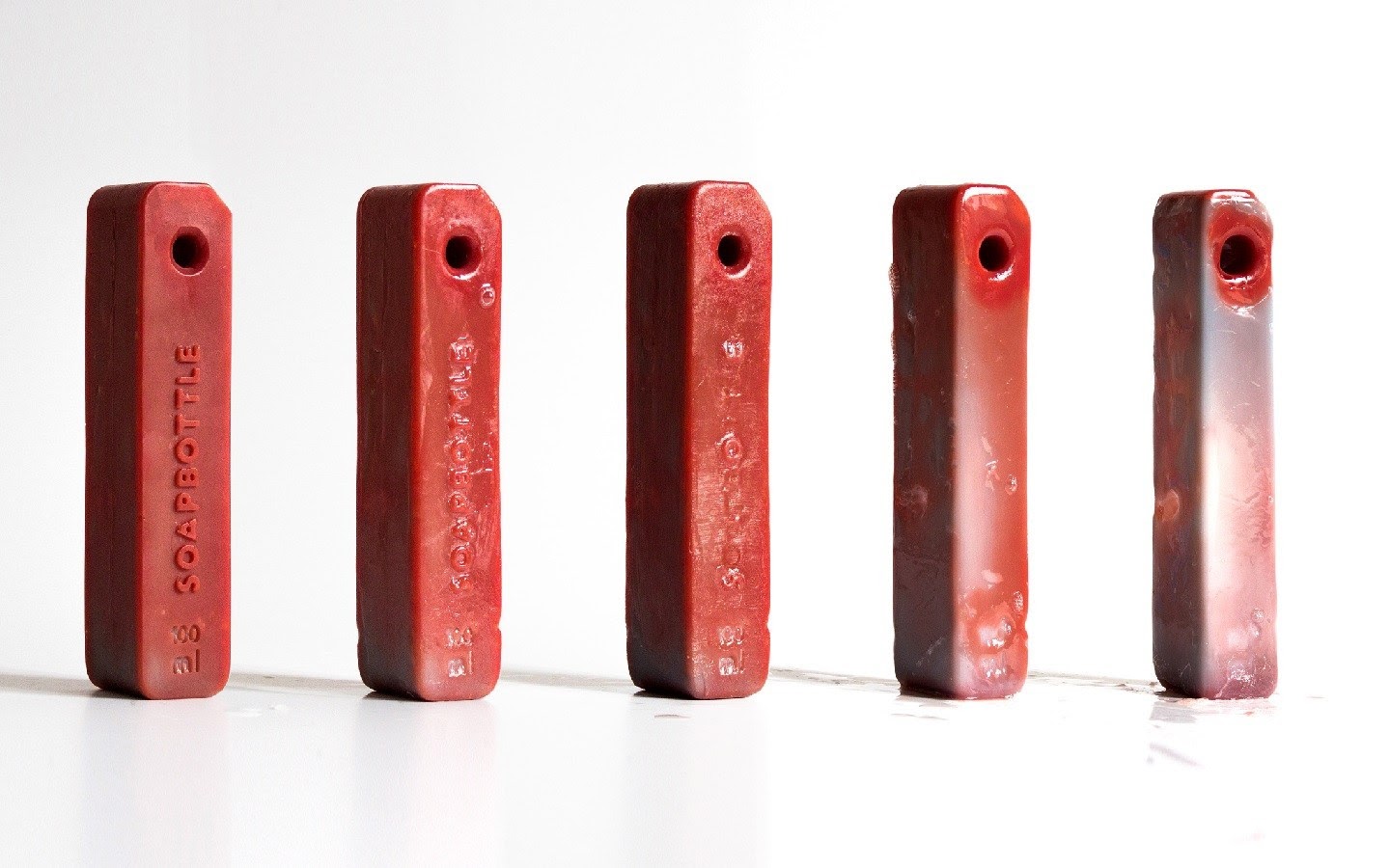
If you’re looking for ways to cut down on your plastic consumption in this next decade, the Berlin-based designer Jonna Breitenhuber has a solution for your shampoos and detergents: bottles made of soap. Sensibly called Soapbottles, Breitenhuber’s products are themselves encased in a hard soap that slowly dissolves over time, thereby doing away with the need for plastic altogether. In order to stall the inevitable dissolution of the bottle, Breitenhuber has also designed a loop and string at the top of each bottle, to help with dispensing.
Let’s Talk About It
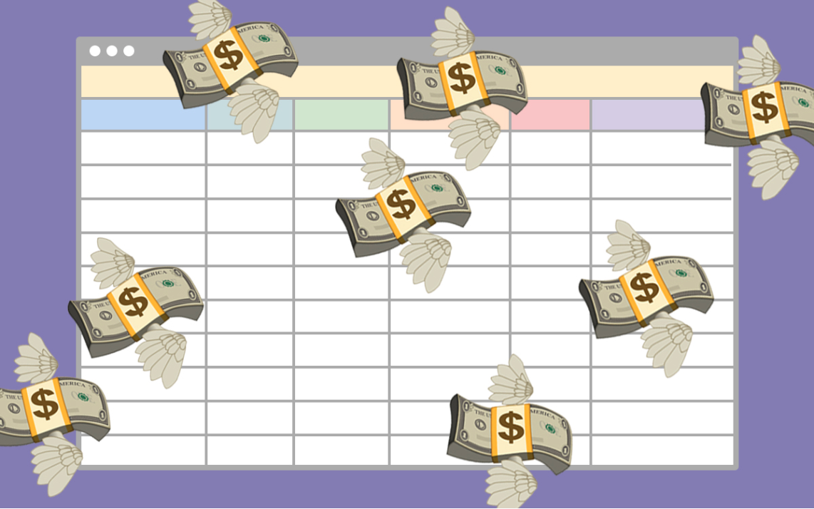
Nobody likes to talk about money, but sometimes it’s necessary. Eliminating salary speculation, as AIGA Eye on Design notes, can narrow the gender pay gap by encouraging women to negotiate and encouraging managers to develop fairer formulas for raises.
Following the lead of some other industries and cultural institutions, AIGA has built a spreadsheet for salary transparency. Any graphic designer can enter his or her salary information, and it’s always anonymous. The result could be some helpful insights regarding salaries in the design world and some powerful steps for employees seeking fair compensation.
