November was a busy month—impeachment hearings, global unrest, and the dubious debut of the Tesla Cybertruck. But, as usual, the design world trudges on.
Here are the best things we saw this month.
Archiving the world’s pigments
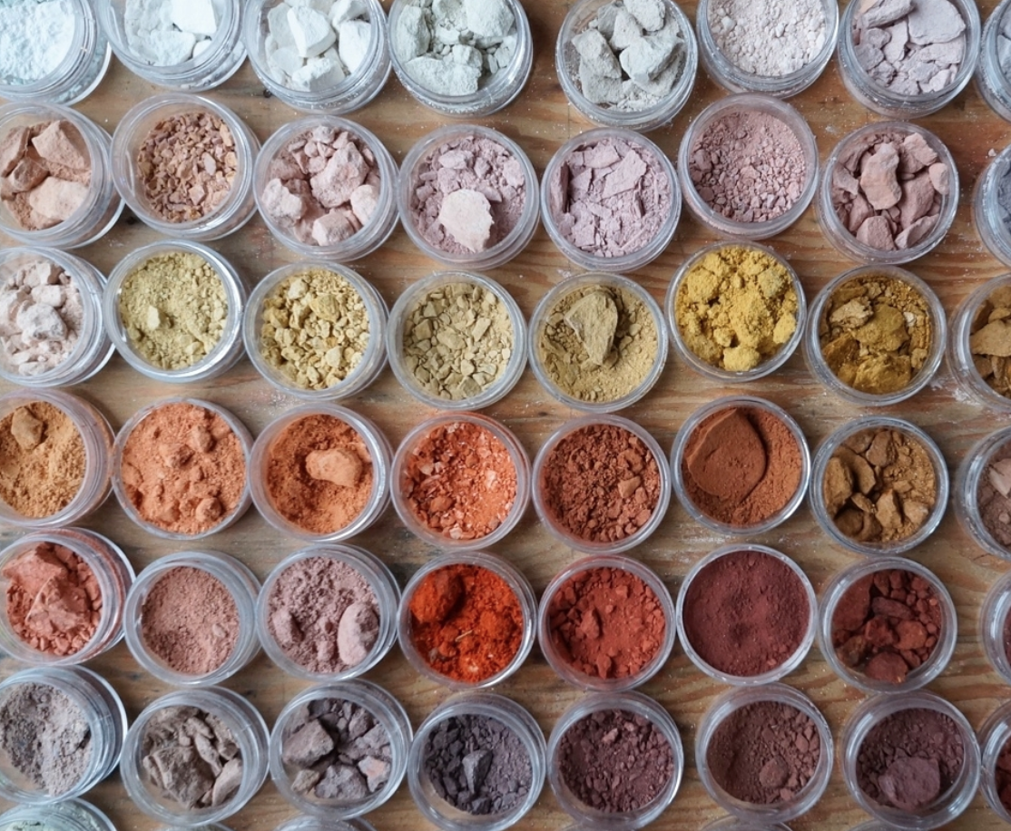
Heidi Gustafson has undertaken a big project. She’s out to collect the world’s iron and earth pigments—in other words, ochre. In a recent profile in T Magazine, her process of foraging for colorful mineral deposits across the globe is described as a kind of spiritual practice as well as an artistic one. To keep up with the ever expanding Ochre Archive, follow Gustafson’s travels on Instagram.
New look for a classic logo

The Atlantic launched a brand new visual identity, the “most dramatic overhaul in its 162-year history,” according to its website. On top of a full redesign of the print magazine, the website, and the app, the company has transformed its logo, replacing the iconic wordmark with an elegant A in the magazine’s new typeface, Atlantic Condensed. They’ve also introduced an assortment of new, nautical-themed emblems for the print edition—an homage to the Poseidon insignia that’s been a part of their visual brand since the 1910s.
The winning Presidential brands
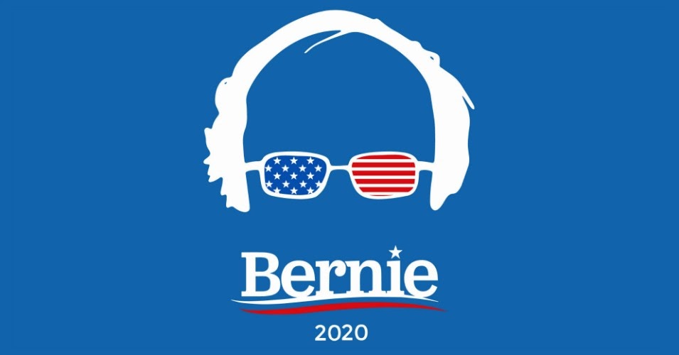
The votes are in for America’s favorite presidential candidate logo. Promotional-product company Crestline hired an independent research firm to ask 1,250 voters—both Republicans and Democrats—to put their politics aside and assess each candidate’s brand on a scale from 1 to 10. Bernie Sanders’ balding head led the pack, with an average score of 7.16. His brand was closely followed by those of Joe Biden, Tulsi Gabbard, and President Trump.
On the other hand, Elizabeth Warren sat all the way at the bottom of the rankings. Her unique branding uses vibrant colors—not the traditional red, white, and blue—and included quirky stickers with handwritten lettering and GIFs to grab the attention of voters online. In this poll, her dark blue and mint green wordmark logo ranked an unimpressive 3.89 out of 10.
What user friendly really means
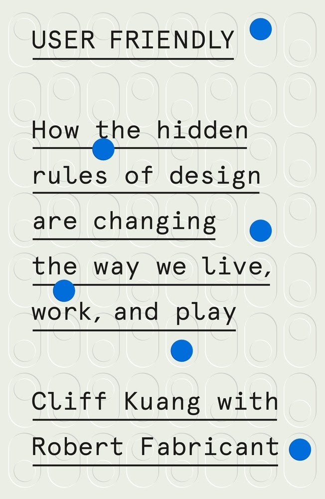
Cliff Kuang knows exactly what’s wrong with Apple’s design and how to fix it. In his new book, User Friendly: How the Hidden Rules of Design Are Changing the Way We Live, Work, and Play, Kuang shows how the company developed its products around two central “metaphors”—the top of a person’s desk (for devices), and the general store (for applications).
But that’s not really compatible with the reality of how we use apps, or our devices. Apps are relational—they flow in and out of our connection to each other. This underlying conflict is what makes our digital lives so frustrating—and it’s why Kuang thinks it’s time for a new metaphor.
“Who knows how much more satisfying our digital lives might be,” Kuang says, “if the governing metaphor for smartphones were one of human connection, rather than programs.”
Quid Pro Sans
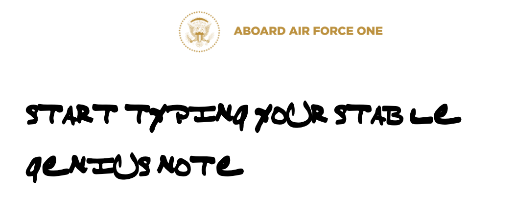
You probably noticed the handwritten notes that President Trump jotted down before speaking to White House reporters regarding his impeachment proceedings. With an unusually large-tipped Sharpie, Trump scribbled some talking points onto a notepad, a selection of which read, “I WANT NOTHING. I WANT NOTHING. I WANT NO QUID PRO QUO.”
Thanks to the quick work of Rick Banks’ type foundry F37 and the New York office of the agency Jones Knowles Ritchie, anyone can take notes like POTUS. Final Word From The Pres makes Trump’s handwriting font, dubbed “Quid Pro Sans,” available for online use. The site also allows visitors to do a little “quid pro quo” of their own… by donating to the ACLU in exchange for accessing the free font tool.
Another fun feature? The tool automatically replaces almost 100 different words with some of his most-repeated Trump-isms. Try inputting “thing,” “man,” or “Bernie,” and see what it gets changed to.
Glitched
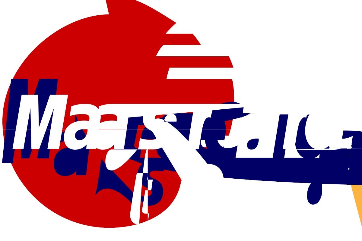
With the colors swapped, shapes shifted, and words distorted, can you recognize this logo?
If you got it, good eye. For everyone else, there’s Mastercard.
Glitch Logos, a Twitter bot created by Internet artist Darius Kazemi, redraws some of the world’s most popular brand logos. Waste time scrolling through its feed, trying to identify these glitched versions of brands we encounter daily.

