September brought climate marches, impeachment threats, and a British parliament shutdown. But when we weren’t consumed by the spectacle of political theater and our growing sense of impending doom, we found inspiration in what’s happening in design. Here are our eight favorite discoveries from the month.
Dance, Pixel, Dance!
An artist and game developer who goes by PixelDanc3r is behind this animated map of the U.S. and the more we look at it, the more it looks like the Super Mario World Map. He’s also animated Venezuela, Brazil, and Argentina in a similar retro style of the 16-bit video game. Something tells us he’ll be adding to the collection: Follow Pixel Dancer’s Instagram account to keep tabs on his progress.
A Full Dose
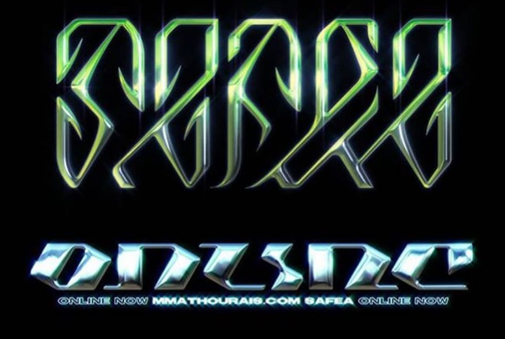
In the latest issue of Eye on Design, Emily Gosling identifies the new trend in psychedelia: “acid graphics,” a futuristic take on the trippy designs of the ’60s and ’70s. This contemporary LSD-inspired look is “tinged with irony,” forgoing the quintessential rainbow tie-dye motifs for a significantly darker, techno DJ style. The increasingly popular liquid metal typography is also related to this larger trend. See more acid graphics in action on the Instagram account @acidgraphix.
Stitched Together
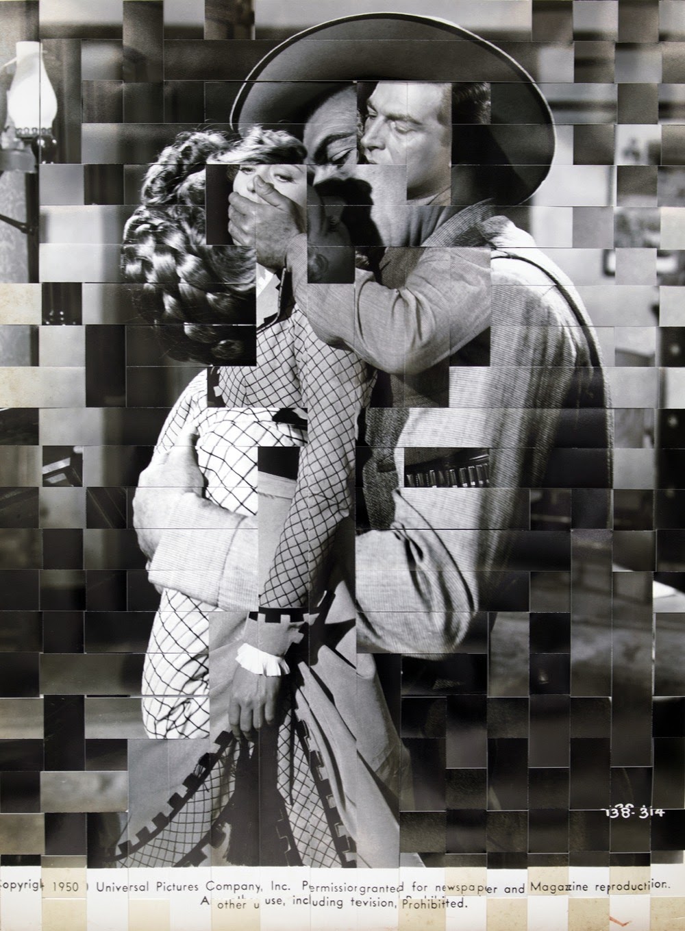
The photographer Heather Oelklaus’s project O.P.P. (Other People’s Photography) involves altering silver gelatin and inkjet prints of typical American scenes, often taken from Hollywood stills, by weaving them together. Oelklaus’ sliced and distorted images are a critique of old historical narratives—and an attempt to recontextualize them. H/T to Jason Kottke.
The Space Beyond
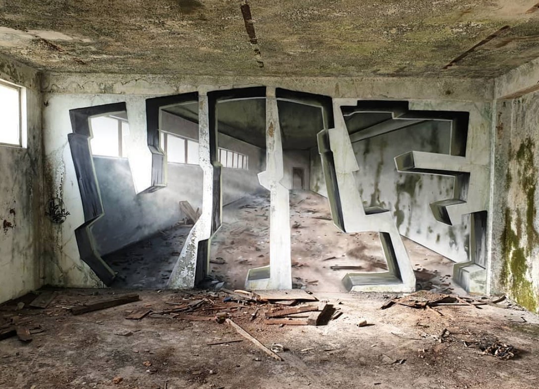
The Portuguese graffiti artist known as Vile is a master of trompe l’oeil. His recent photorealistic tags are painted to look as if they continue into the space beyond the wall, producing the effect that Vile’s using something more like a sledge hammer than a spray paint can. See more of his laser-sharp wall art on his Instagram account.
Shopping for Less
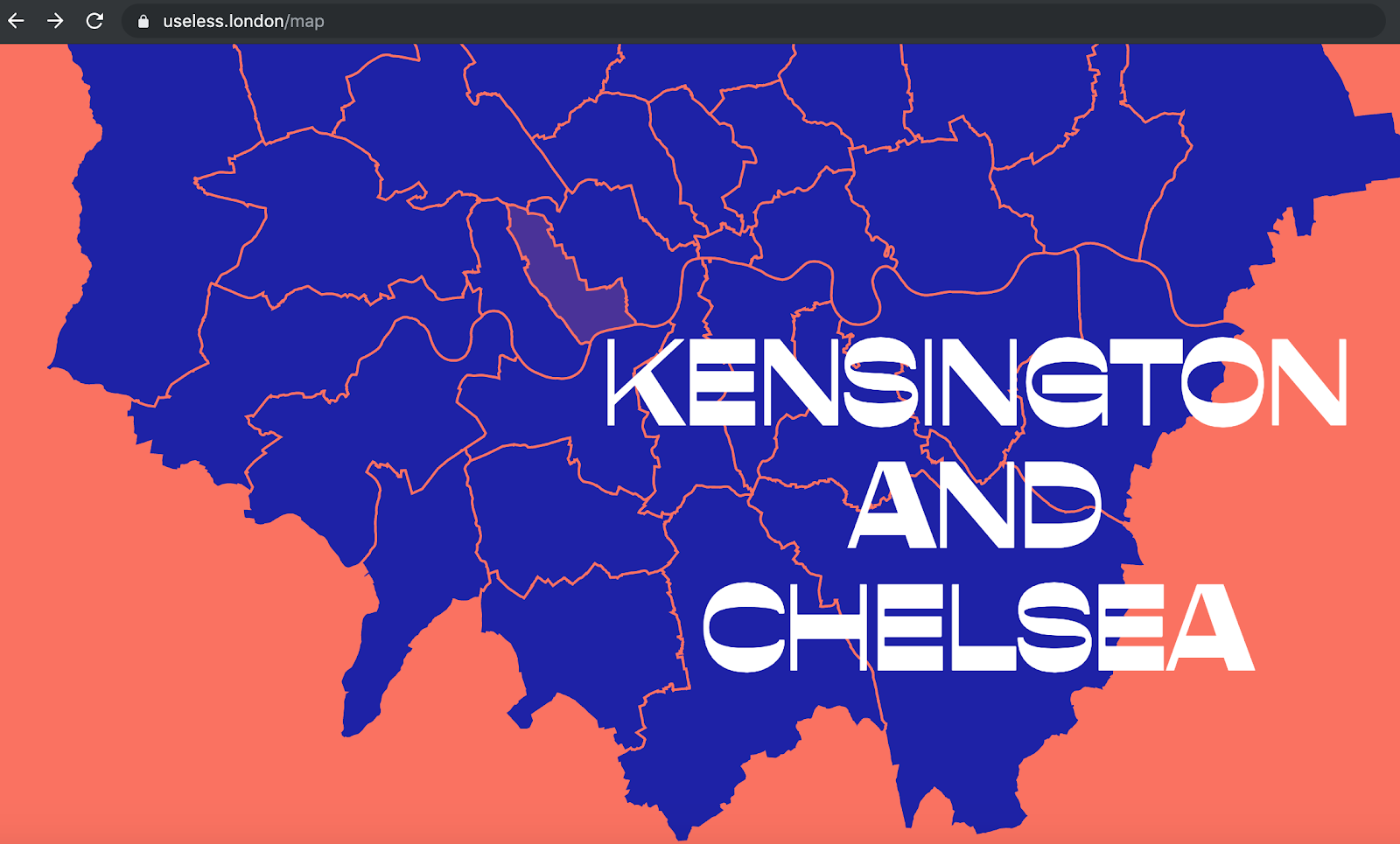
Nice and Serious, the creative agency with an ethical bent, has put together a “digital directory” to help consumers locate the more than 40 zero-waste shops in London. The brightly colored and playfully designed website sports an interactive map of the city detailing which stores offer plastic-free options and tips on how to reduce disposable plastic usage. What’s more, Useless users are invited to submit their own suggestions to add to the map through a vetted crowdsourcing function.
Design World Warning

Rob Walker’s “Why Every CEO Needs to Think Like a Hacker, Stalker, or White Nationalist” is a must-read for all those working in design in the digital era. The problem, as Walker sees it, is that “digital design isn’t cynical enough.” He argues that the time has come to start practicing “Design for the Worst,” in other words, anticipating the “nefarious purposes” of “bad actors” when designing digital products. Because the “gosh-we-didn’t-see-that-coming defense” isn’t going to cut it anymore.
Architecture Comes Clean
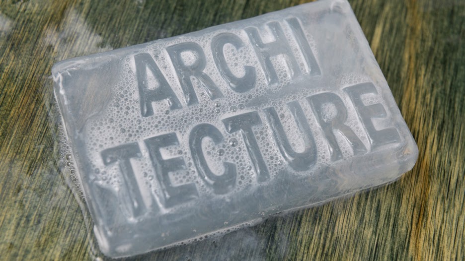
This bar of soap, created for this year’s Oslo Architecture Triennale, is meant to do more than get your hands clean. It’s a commentary on the wide gap between architectural design and the natural degeneration of building environments over time. As the triennale progresses and the soap gets used, the “architecture” tagline wears away, leaving nothing more than a clear bar. Yujia Bian, the soap’s designer, told Dezeen that this metaphoric disintegration of “Architecture with a capital A” is also meant to challenge the field’s commitment to creating shared, public spaces—when in fact, many of those spaces aren’t designed with public, free use in mind.
Back in the U.S.S.R.
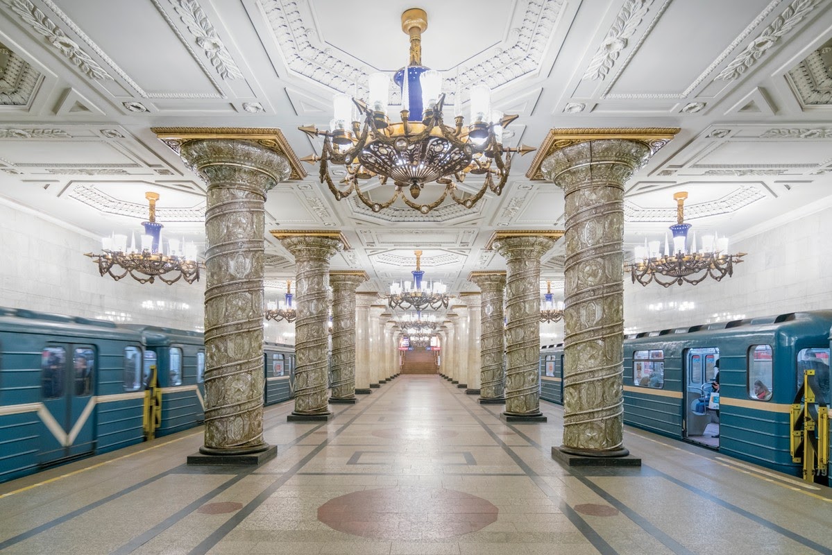
Photographer Christopher Herwig, known for his project documenting Soviet-era bus stops, traveled around seven countries to photograph all of the underground metro stations of the former Soviet Union. Many of these stations are opulently designed, decorated with chandeliers, columns, ornate ceiling molding, and relief murals. And, because many were used as nuclear bomb shelters during the 20th century, are in beautiful condition. See them all in Herwig’s latest book, Soviet Metro Stations.
