From glamorous, chili pepper-red flight attendant uniforms and gilded playing cards to airport terminals worthy of landmark status, few brands tapped into the corporate identity and mid-century modern design movement quite as stylishly as Trans World Airlines (TWA) during the “Jet Age” of air travel in the ’50s and ’60s.
During this industry-defining heyday—when passengers like Howard Hughes drank martinis at 30,000 feet and passengers flew in three-piece suits rather than in Under Armour—the importance of design grew as a function of business and customer experience. Meanwhile, the sheen of the latest technology helped soothe the skittishness of first-time flyers at a time when practically everyone was a first-time flyer.
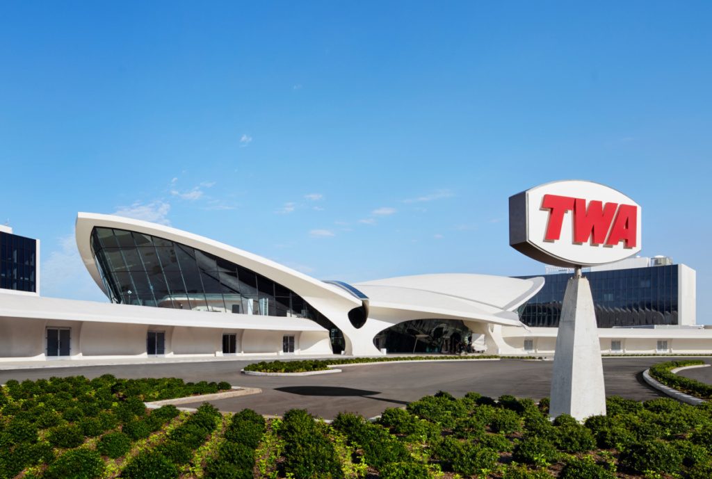
Over a half-century later, that design ethos has been recreated in the TWA Hotel at JFK Airport, a modern love letter to this mid-century experience, a visionary dovetail of corporate identity and neo-futurist genius.
The MCR/MORSE-restored hotel property, located within the TWA Flight Center (which was designed by Eero Saarinen and opened at JFK Airport in 1962), houses five bars and restaurants, an aviation museum, an observation deck, 512 guest rooms, and a rooftop infinity pool, among other modern amenities—all celebrating the now-defunct TWA.
This celebration of the Jet Age in the form of a multi-million-dollar hotel is a testament to what makes great branding timeless and memorable. To honor the terminal’s rebirth, we look at three core aspects of TWA’s brand storytelling and how the built a brand by leading with design.
Prepare for takeoff: treat design as a core function of your brand
Like the graphics standards manual for both the New York City Transit Authority and the National Aeronautics and Space Administration, the foundation for TWA branding and design wasn’t to simply make things look good; it was to provide a unified story and user experience across everything the company did.
From the moment a traveler set foot in Saarinen’s sweeping Flight Center to arriving at their destination’s TWA terminal, the flight was unified by consistent visual experience. This level of cohesive brand storytelling helped travelers connect with TWA emotionally—which, in turn, became a function of driving revenue and business as a form of trust.

The flight plan: Create a classic, then keep it simple.
While the suite of TWA-branded products and merchandise goes deep—flight attendant uniforms, ashtrays, and toy airplanes for younger passengers are all included—there are two consistent design elements that each carries: custom typography and color.
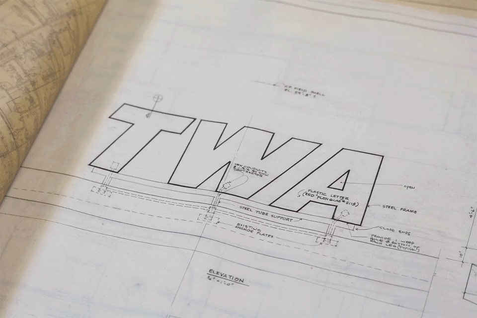
The brilliant red used across TWA assets is easily one of the most distinctive brand elements of all, due both to heavy usage across all mediums and its attention-grabbing hue. But it’s the custom typography that stands out, and what informs the TWA experience at the new hotel.
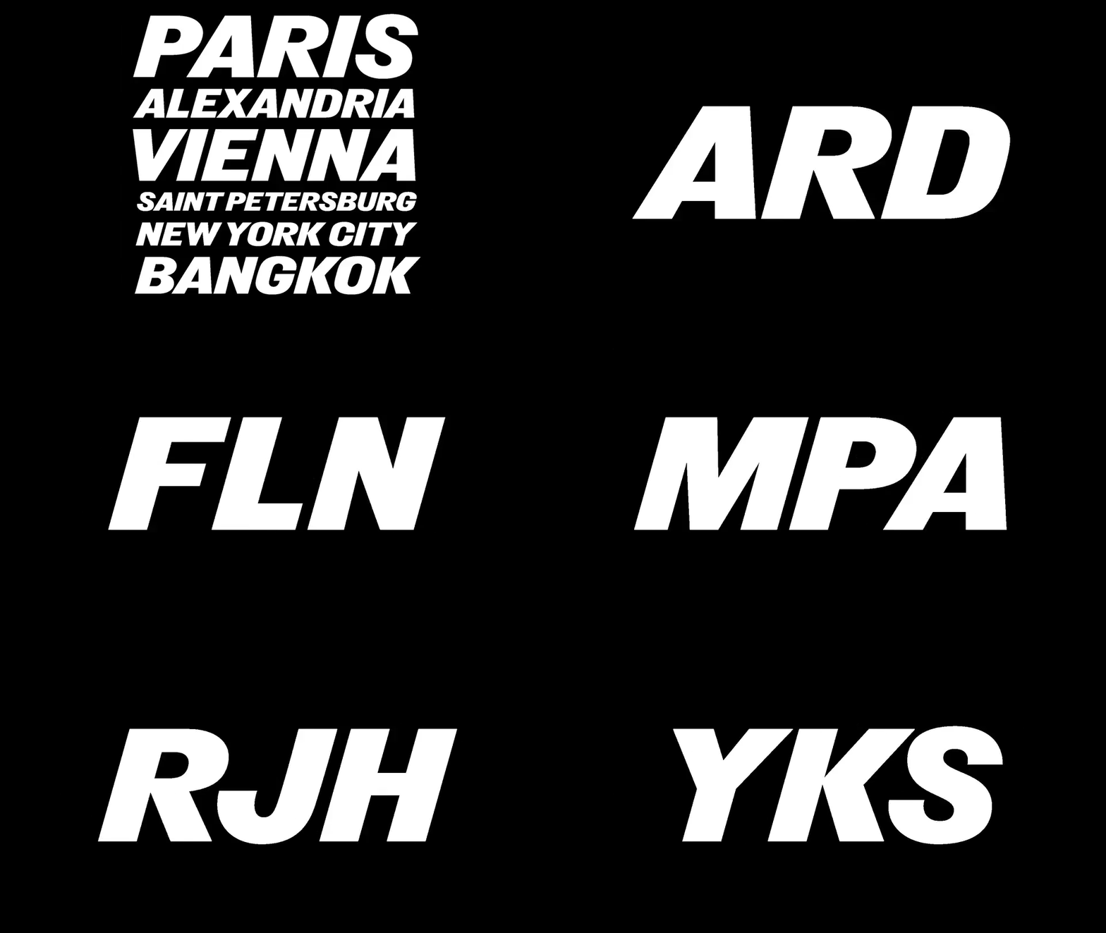
In helping to establish the hotel as an authentic TWA brand experience, the MCR/MORSE team turned to NYC-based design powerhouse Pentagram to give the company’s iconic mid-century type style a facelift. The resulting typeface, Flight Center Gothic, is a culmination of the entire TWA corporate identity experience—distilled and updated to look good as new once again with modern digital tools.

“(The original) looked like a typeface called Derek, which is actually much older than you think it is,” explains Pentagram founder Michael Beirut. “It dates from the late 19th century, even though it looks very modern. I think the appeal to Saarinen and his team was that it looks very kind of Jet Age. We all know what an italic typeface looks like, but that one really leans forward. It looks like it’s going 1,000 miles an hour. And very bold, very plain, chosen to go with the way that the letters TWA appeared on the planes and on the Flight Center at the time. There was no contemporary version of it that we could find that matched those drawings.”
The finished deliverable from Pentagram included digitized versions of each character that were then optimized to be used across multiple applications in the digital age—from web pages optimized for iPhone to printed menus and postcards in the rooms.
Go sky-high: invest in going experiential to tell your full brand story.
While it could be said that TWA’s use of logo-heavy coasters, cocktail swizzle sticks, and flight attendant uniforms all helped create a unified brand experience on their own, none can compare to the brand storytelling captured by Saarinen’s Flight Center.
The futuristic structure—a pioneering example of thin-shell construction—would not only serve as a cutting-edge hub for speeding up travel but also as a coordinated brand experience that helped cement the airline’s growing sense of identity in a physical space, a powerful first impression for travelers where the brand could live and breathe like a beating heart.
From the brilliant red carpeting to the TWA logo-emblazoned departure sign, the Flight Center became the church of TWA branding and an aspirational nod to the future of air travel.

“We wanted passengers passing through the building to experience a fully-designed environment in which each part arises from another, and everything belongs to the same formal world,” explained Saarinen at the time. The resulting structure became one of the most iconic examples of mid-century design and was declared a New York City Landmark in 1994. It eventually earned a spot on the list of the National Register of Historic Places in 2015, and became a hotel in 2019.
For heady brand and design nerds ready to take a time travel back to an era of brand storytelling at its finest, the TWA Hotel is undoubtedly a place worth packing your bags for and adding to the itinerary.
Learn more over at TWA Hotel.


